
Feature Showcase
Every document below is rendered by PeachPDF itself when this site is built, so the
output always reflects the current release. Each card pairs the exact HTML given to
PdfGenerator.GeneratePdf with the PDF that came out — open both and compare.
The previews show the first page of each PDF, rendered on Linux with Liberation fonts
(the same font substitution any Linux server without Microsoft fonts would use).
Want to render your own? Try PeachPDF in your browser — drop in an HTML file, an MHTML archive, or a ZIP of a site folder and get a PDF back. It runs entirely on your machine, in the page, with no server involved.
Backgrounds & Borders
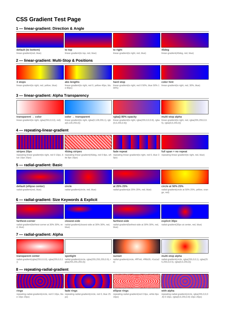
CSS Gradients
linear-gradient, radial-gradient, and conic-gradient: directions, angles, multi-stop and hard-stop color lists, and CSS Color Level 4 interpolation spaces.
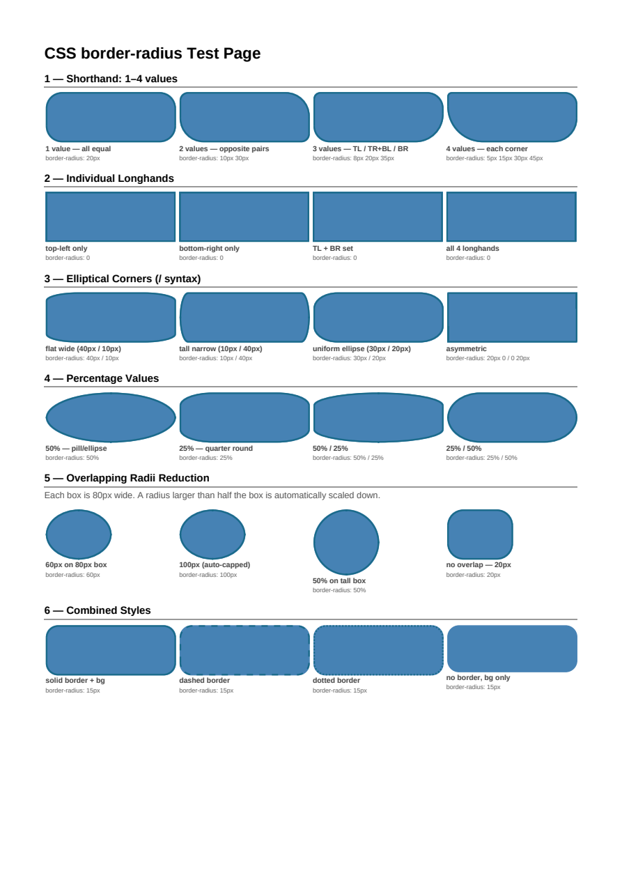
Border Radius
border-radius from simple uniform rounding to per-corner and elliptical radii, on filled and bordered boxes, plus overflow:hidden clipping descendant content to the curve and background-clip's inset curves reduced by border width.
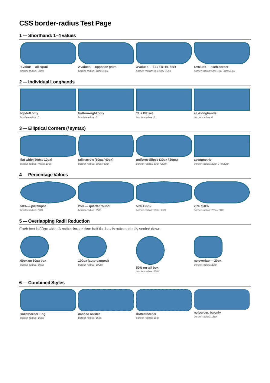
Border Radius (96 DPI)
The same border-radius coverage as the Border Radius showcase, rendered at PixelsPerInch=96 instead of the library's default 72 — confirms rounded borders, backgrounds, and overflow-clip curves render identically regardless of PixelsPerInch.
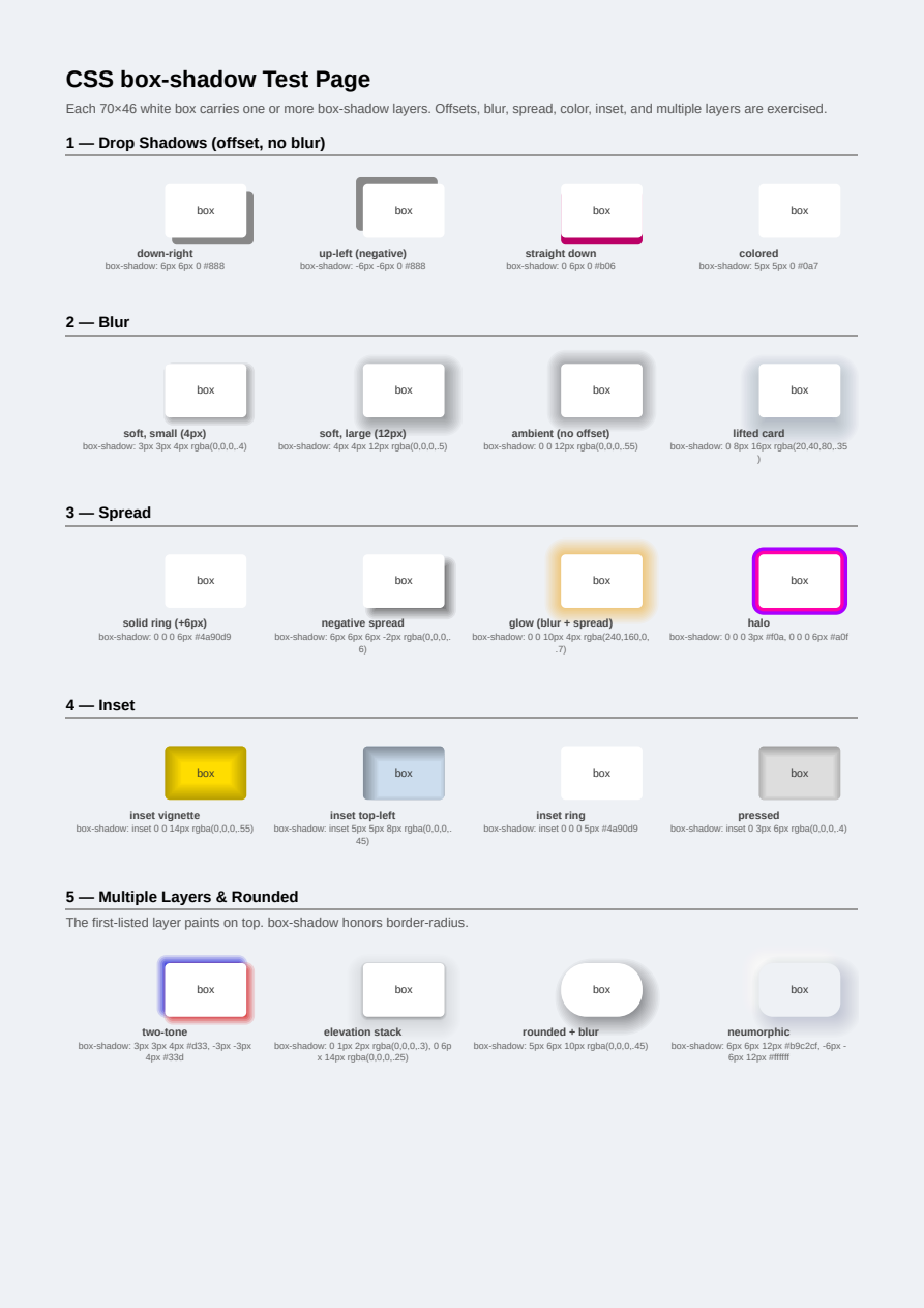
Box Shadow
box-shadow: drop shadows, blur, spread, inset, colored and multiple layered shadows, with border-radius — blur approximated as vector geometry.
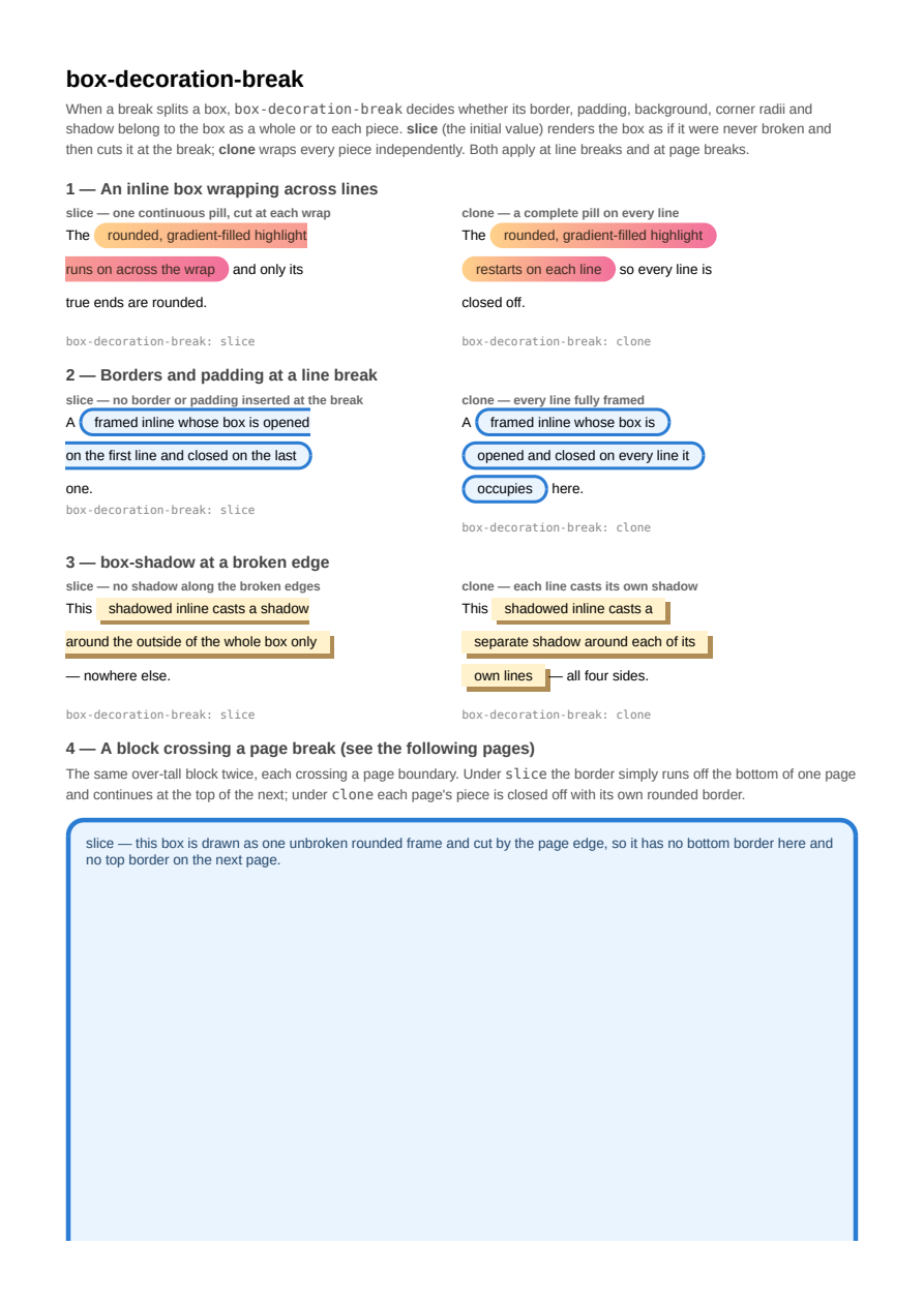
Box Decoration Break
box-decoration-break: slice vs clone at both line-box and page breaks — continuous sliced decorations against independently wrapped per-fragment ones, for backgrounds, gradients, border-radius, borders and box-shadow.
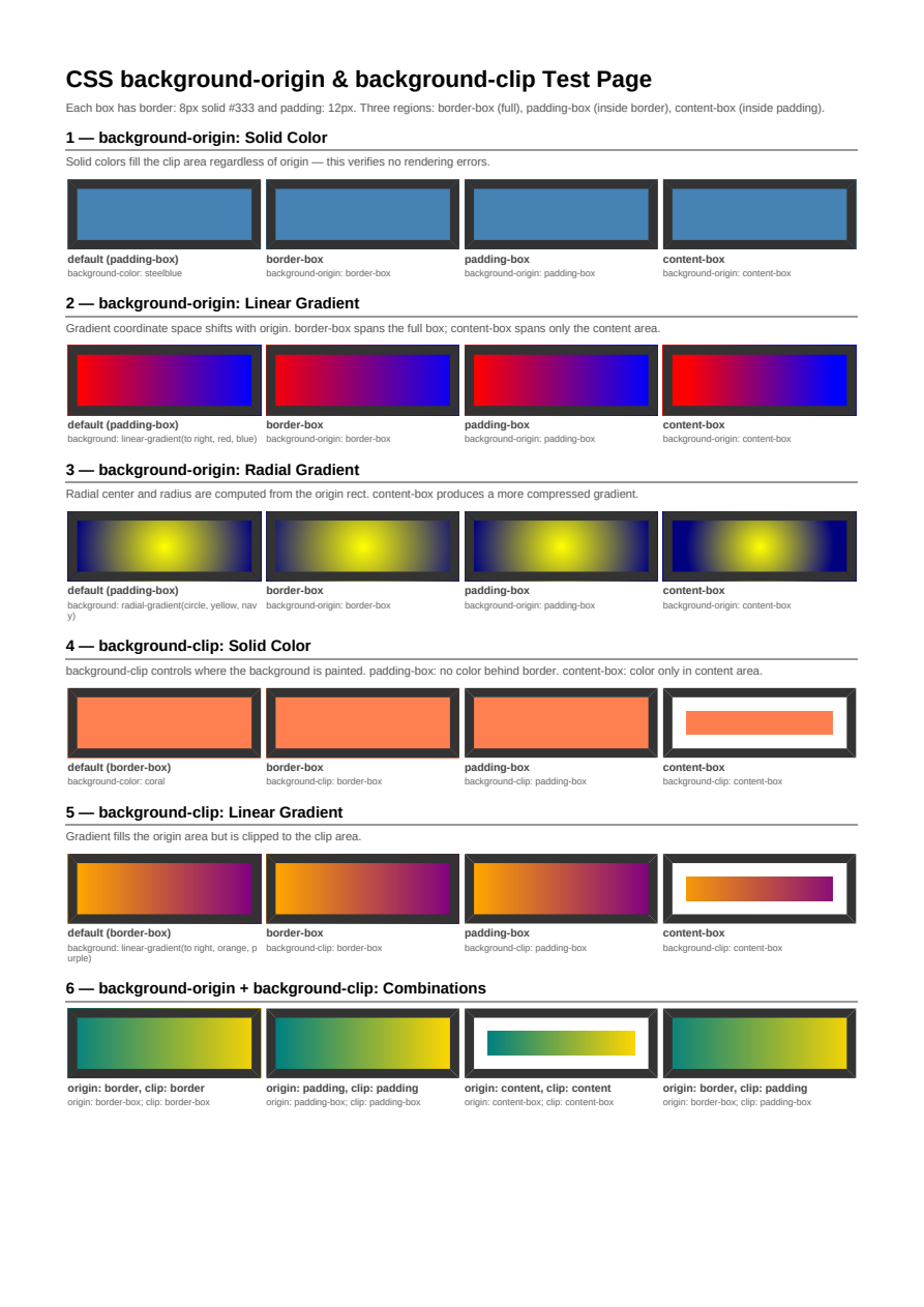
Background Origin & Clip
background-origin and background-clip controlling where a background paints relative to the border, padding, and content boxes.
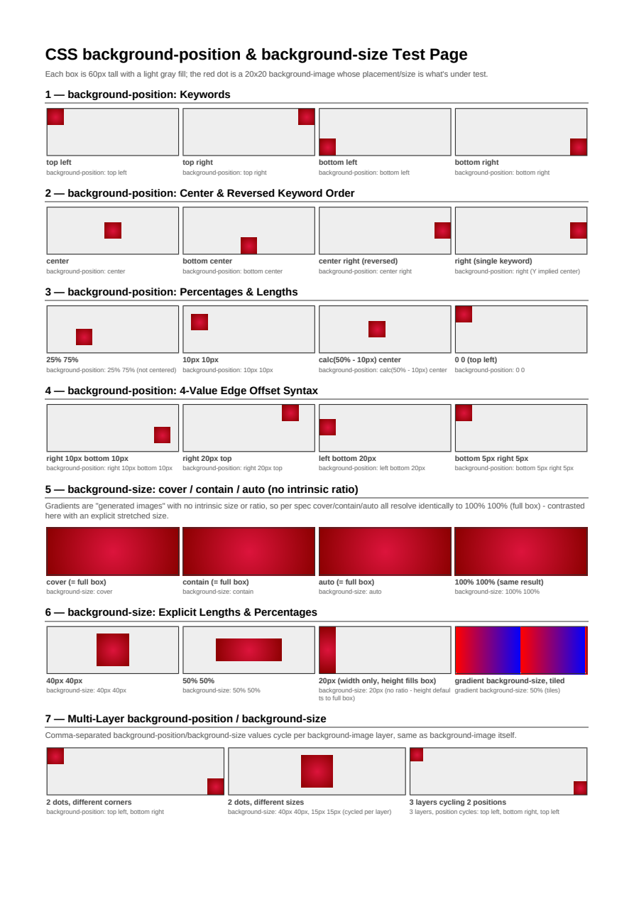
Background Position & Size
background-position and background-size combinations: keywords, lengths, percentages, cover, and contain.
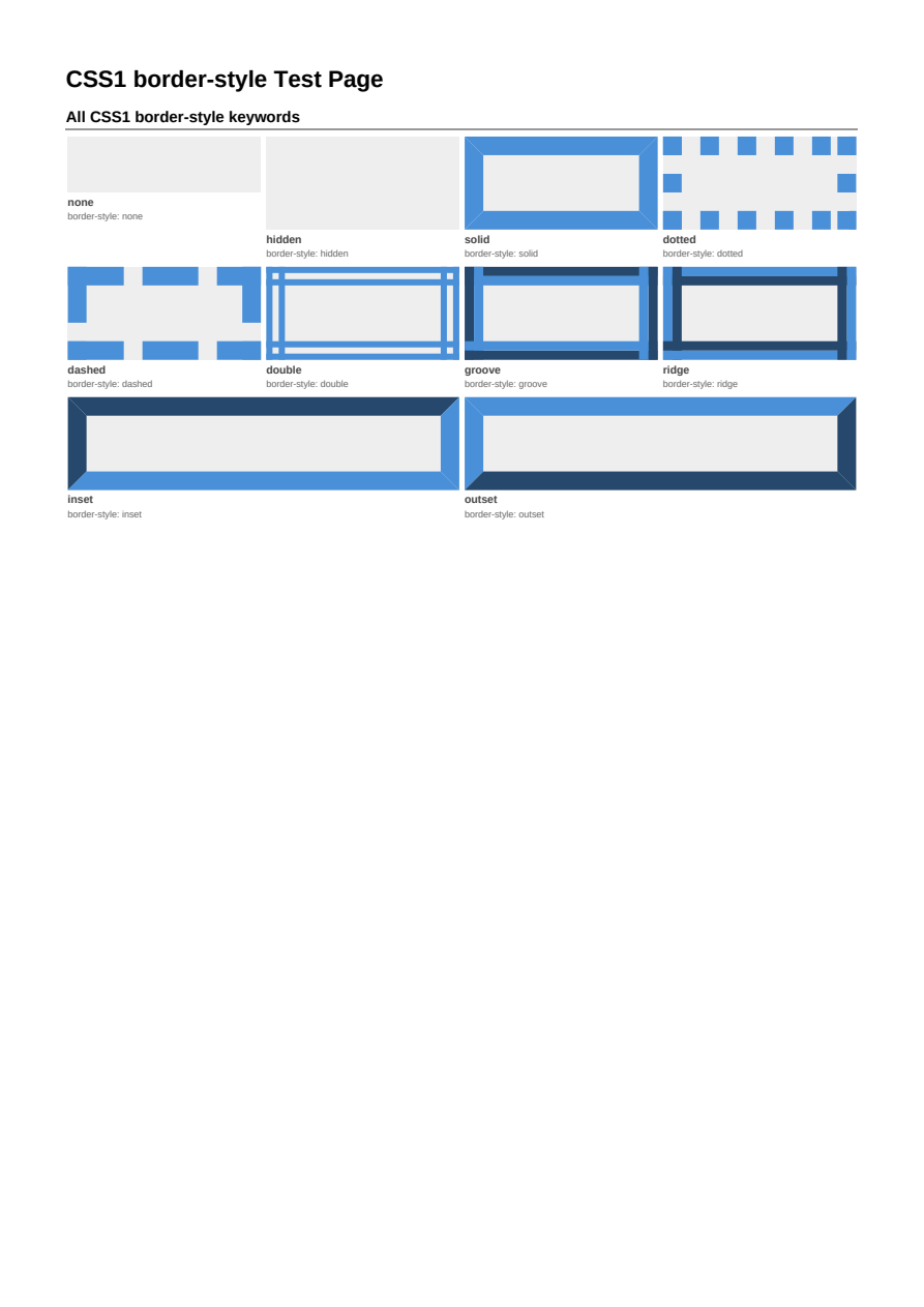
Border Styles
The full set of CSS border styles, from solid and dashed to groove, ridge, inset, and outset.
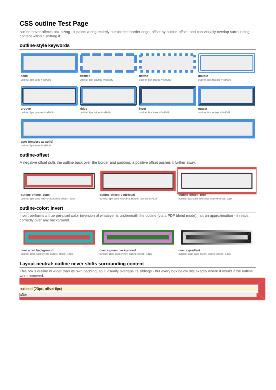
Outline
outline / outline-color / outline-style / outline-width / outline-offset: a layout-neutral ring drawn outside the border edge, including a true per-pixel color inversion for outline-color: invert.
Canvas Background
CSS1 canvas background propagation: body and html backgrounds covering the full page.
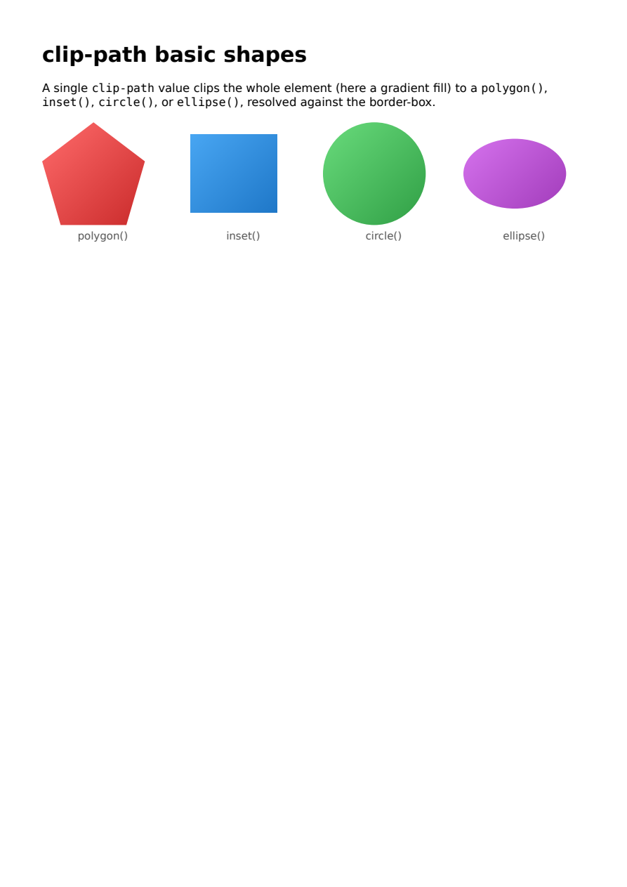
clip-path basic shapes
CSS clip-path with basic shapes: polygon(), inset(), circle(), and ellipse() clip an element (here a gradient fill) to a shape resolved against its border-box. A shared basic-shape grammar validates the value at parse time and the resolved region is pushed as a PDF clip path.
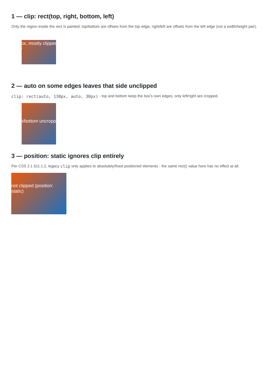
Legacy clip: rect()
The legacy CSS 2.1 clip property (rect(top, right, bottom, left), superseded by clip-path) clipping an absolutely positioned element to a rectangle, including auto edges and its position:static no-op.
Lists & Generated Content
::marker Styling
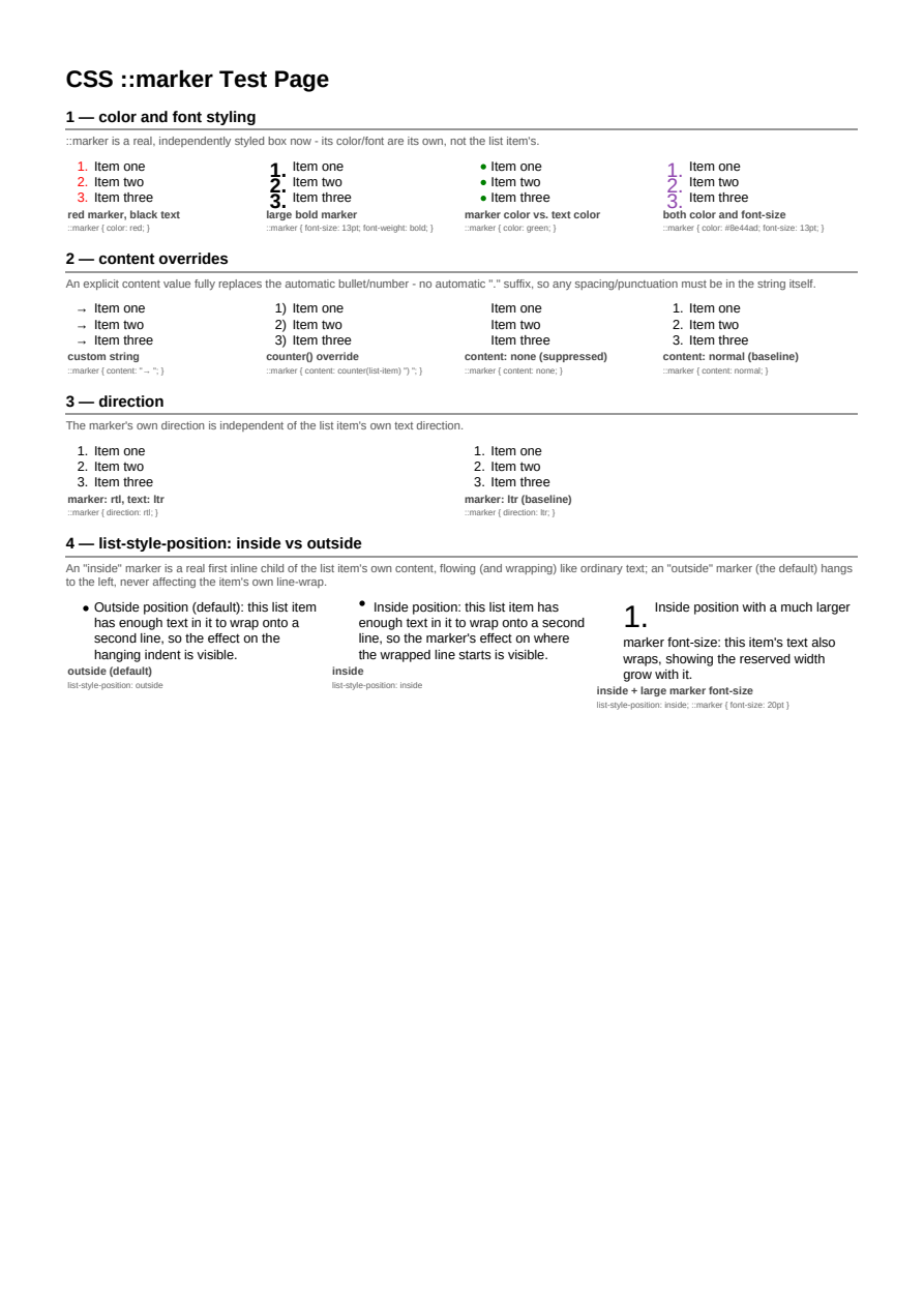
Styling list markers with the ::marker pseudo-element, including real per-item numbering via the list-item counter.
List Style Type Coverage
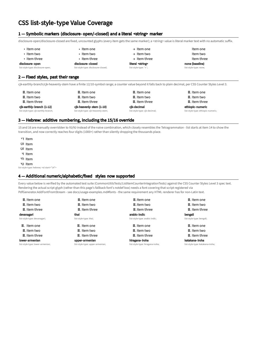
The full CSS Counter Styles Level 3 predefined-style coverage list-style-type now supports - numeric, fixed, symbolic, and additive systems, plus a literal <string> marker.
Generated Content Images
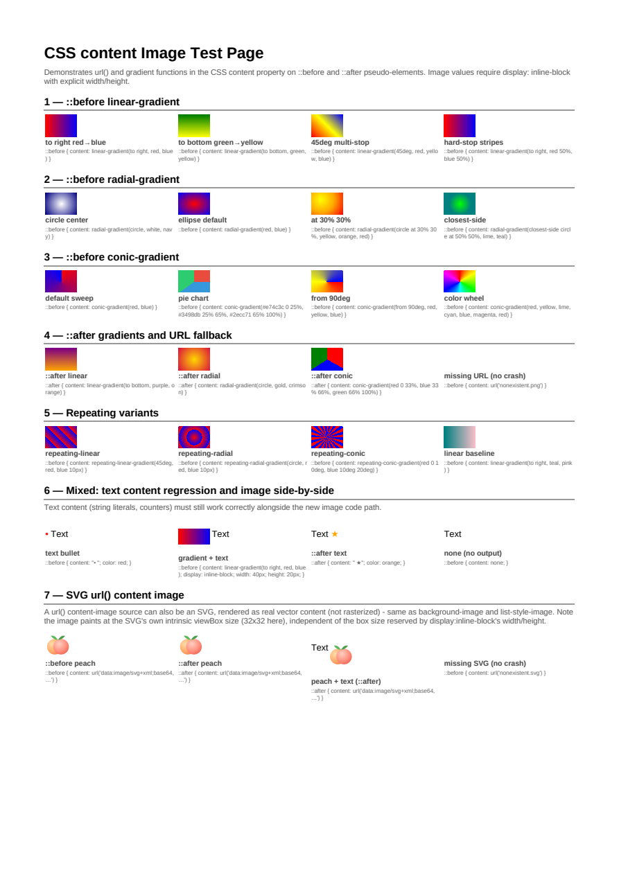
Images inserted through the CSS content property on generated content.
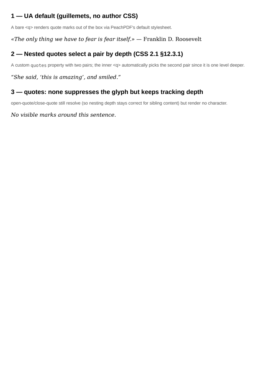
quotes & open-quote/close-quote
The CSS 2.1 quotes property and the open-quote/close-quote/no-open-quote/no-close-quote content keywords, including nesting-depth pair selection and the default q::before/::after UA styling.
Paged Media
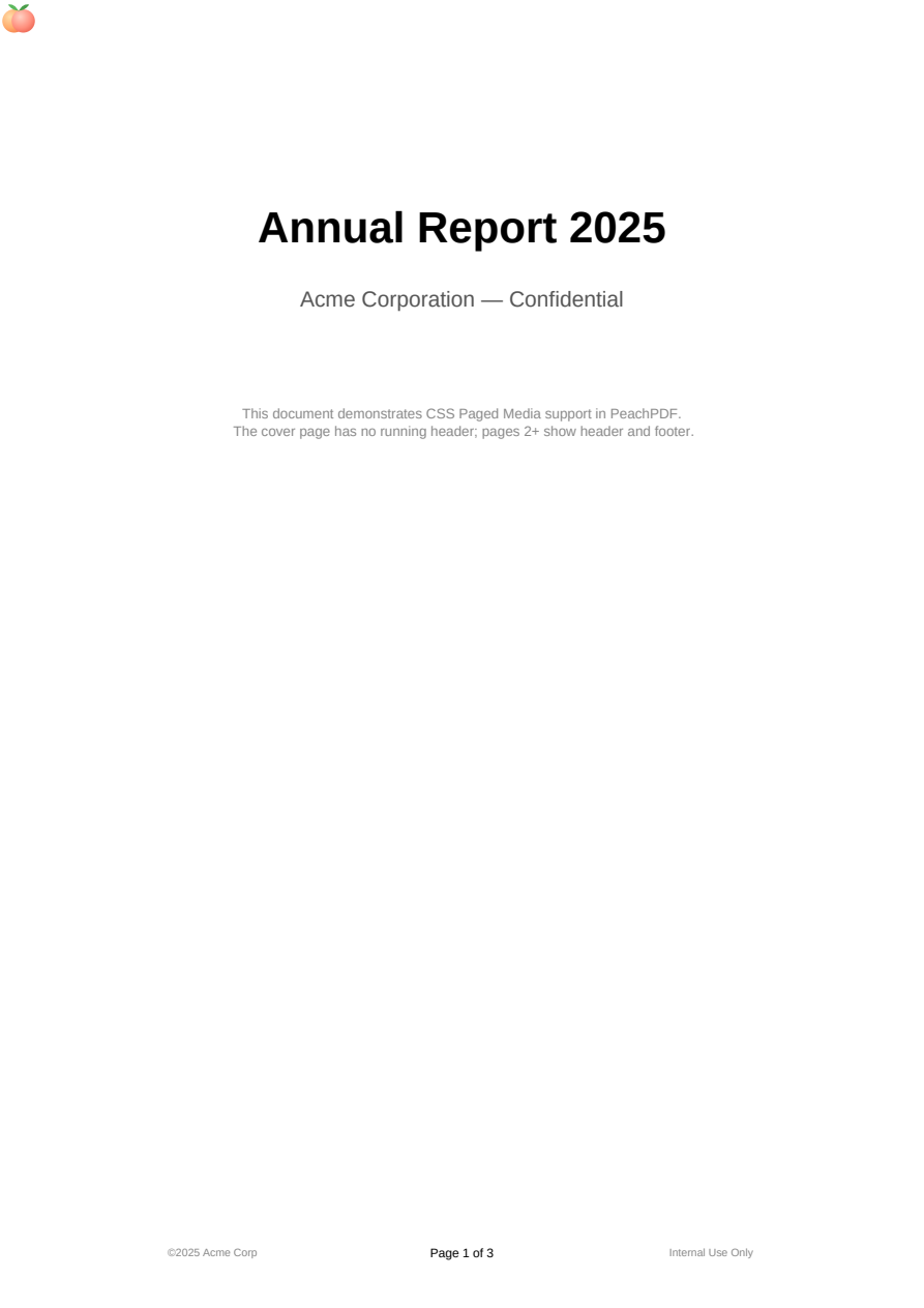
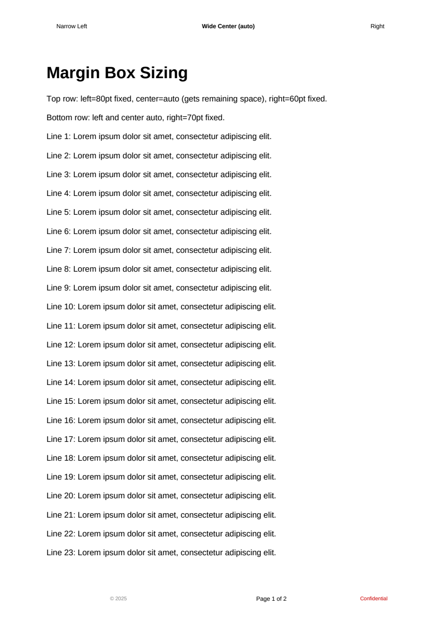
Paged Media
@page rules with margin boxes, running headers and footers, and page counters, including a url() logo image in a margin box (@top-left-corner).
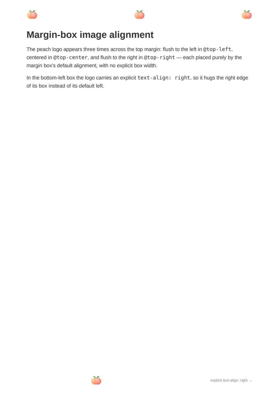
Margin-box Image Alignment
An image in a @page margin box follows the box's alignment like text does: default from the box position (@top-left/@top-center/@top-right) plus an explicit text-align override.
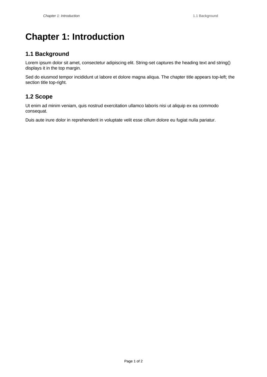
Named Strings
Running headers populated from document content with string-set and string().
Running Elements
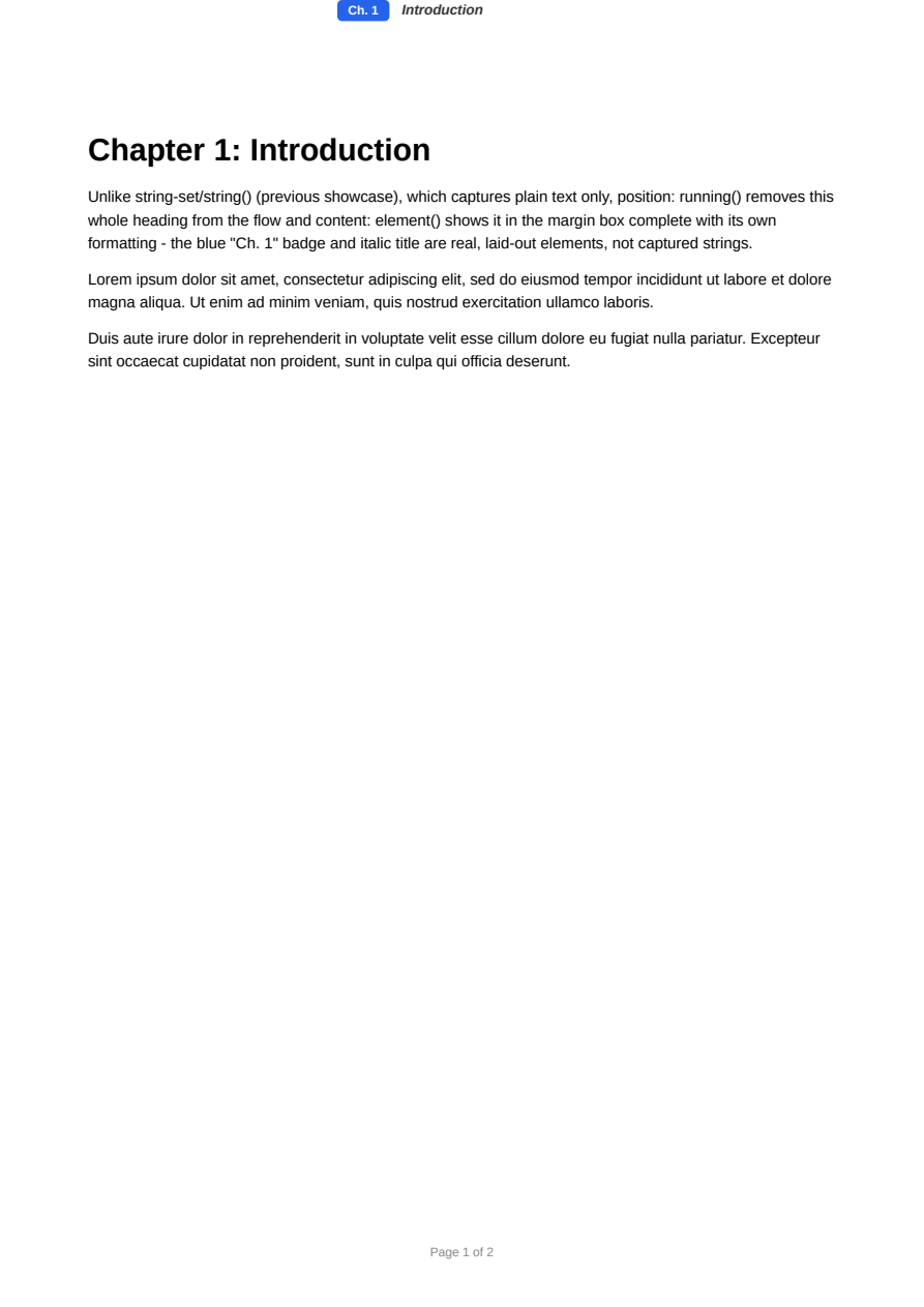
Running headers with full formatting fidelity via position: running() and content: element() - unlike string-set/string(), the margin box shows a real, laid-out element (colors, badges, nested spans), not just captured text.
Footnotes
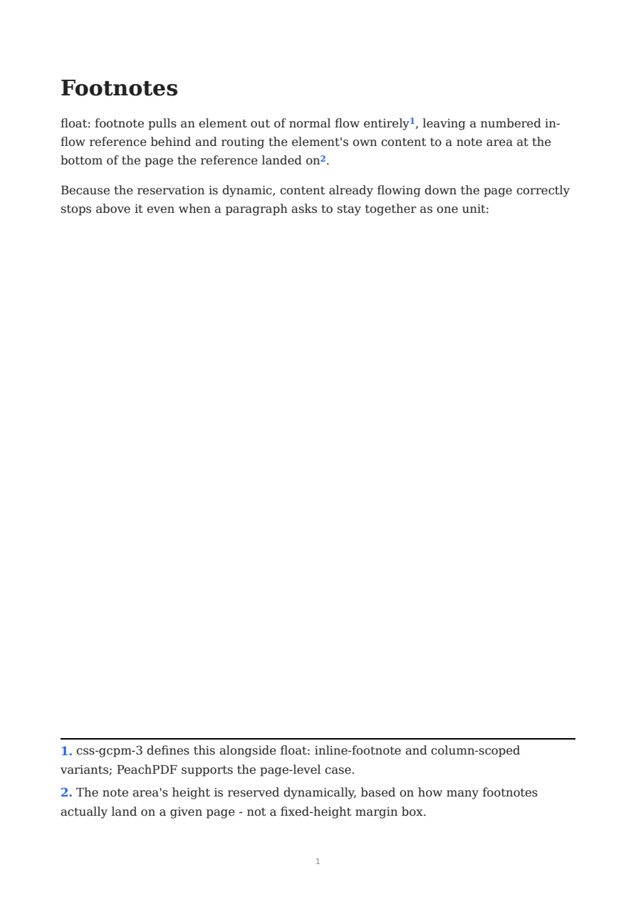
css-gcpm-3's float: footnote: a numbered in-flow reference, a note area whose height is reserved dynamically per page based on how many footnotes land there, and break-inside: avoid content correctly kept clear of the reserved strip.
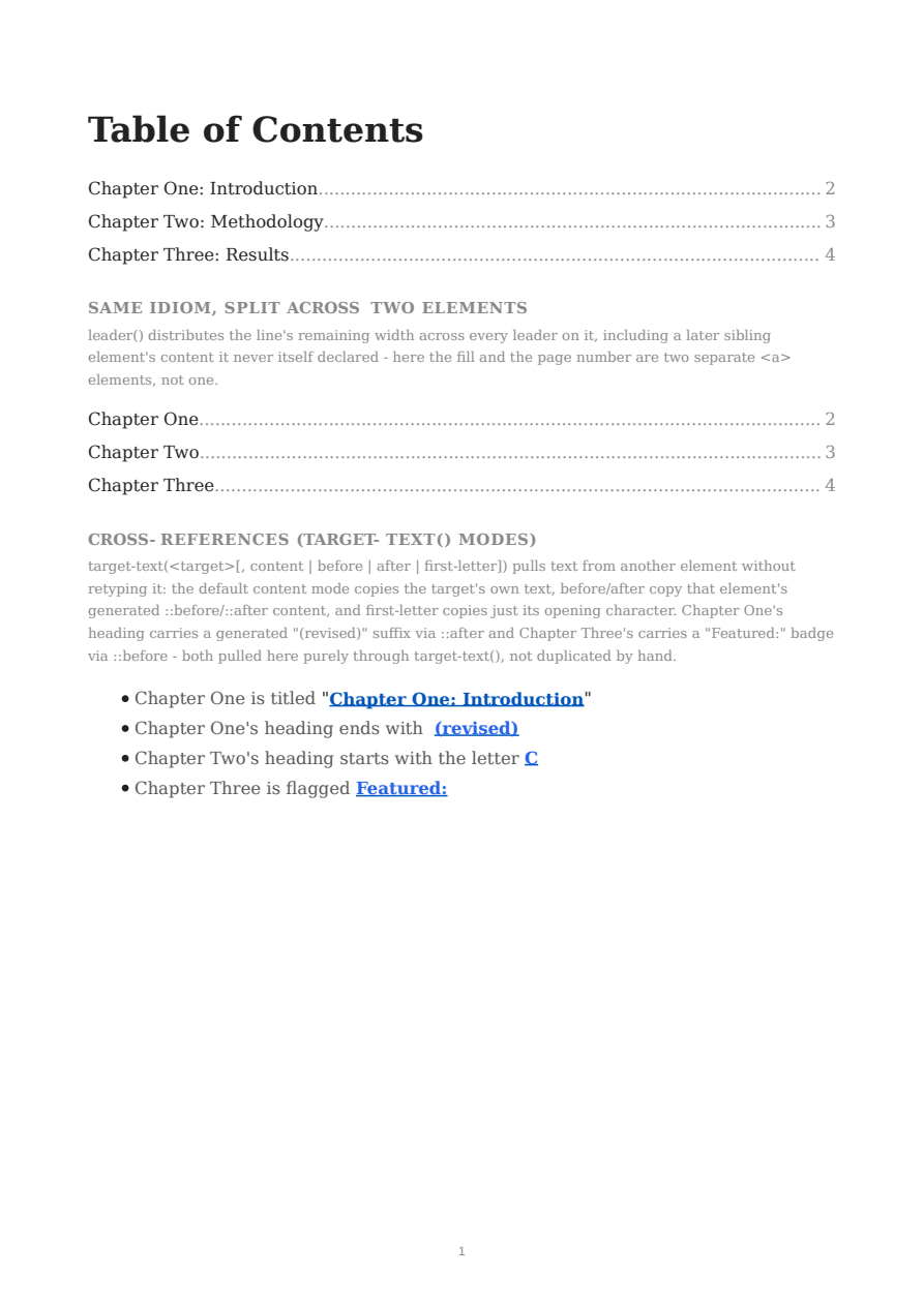
Table of Contents & Cross-References (target-counter / target-text / leader)
A hand-authored table of contents with real, non-stale page numbers - leader(dotted) fills the gap and target-counter(attr(href), page) resolves the actual page each chapter lands on after pagination, including split across separate elements on the same line. A cross-reference list demonstrates all four target-text() modes: content, before, after, and first-letter.
Per-page Margins
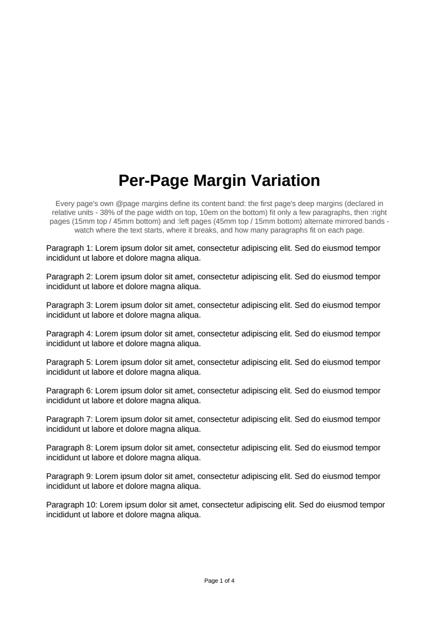
Layout-affecting per-page margins: each page's own @page margins define its content band, so text flows into visibly different-height pages (deep first page, mirrored :left/:right bands) - with relative units (%, em) supported in per-page rules too.
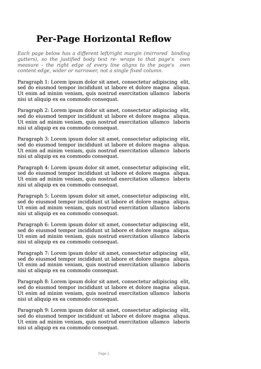
Per-page Reflow
Left/right per-page margins reflow content to each page's own width: mirrored :left/:right binding gutters re-wrap the justified body text to each page's own measure (CSS Paged Media page-area containing block), not just shift it.

Full-Bleed Pages
An edge-to-edge cover via @page :first { margin: 0 } - the first page's content band is the entire sheet (corner marks touch all four paper edges), followed by a normally margined page.
Named Pages
Routing content to differently-styled pages with named @page rules and the page property.
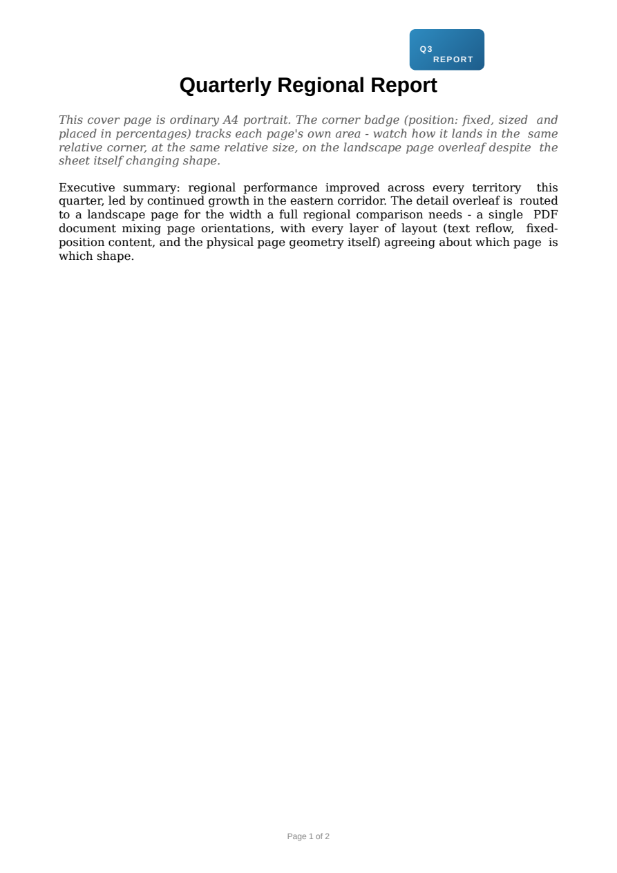
Mixed Page Orientation
One PDF mixing portrait and landscape pages via a named @page rule's own size - the landscape section's body text genuinely re-wraps to its own wider measure, and a fixed-position corner badge (percentage left/top/width) stays correctly placed and sized on every page despite the sheet itself changing shape.

Directional Page Breaks
Chapters that always open on a right-hand page: break-before: recto inserts a blank verso page when it needs one, and the outer-edge folios show the left/right alternation. The closing colophon declares its break on the heading rather than the division, so it is resolved against the division's own predecessor.
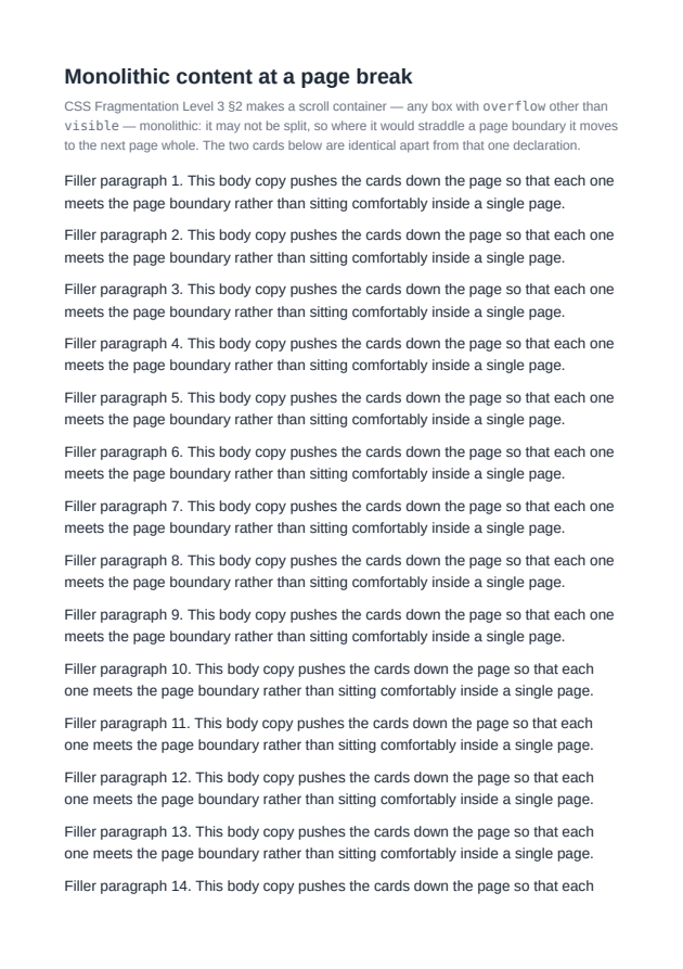
Monolithic Content
A box with overflow: hidden is a scroll container, which CSS Fragmentation §2 forbids breaking: it moves to the next page whole instead of being cut in half by the page boundary. A flex line and a grid row that ask not to be broken move as a unit for the same reason, and the lines below a moved one follow it rather than staying put. A forced break is taken from either side of a break point, so break-after on one line opens the next page for the line after it — and break-after: avoid there moves the earlier line too, so a heading is not stranded on the page its section body just left. Under flex-wrap: wrap-reverse all of this is read down the page rather than down the source, which is the reverse order there.
Orphans and Widows
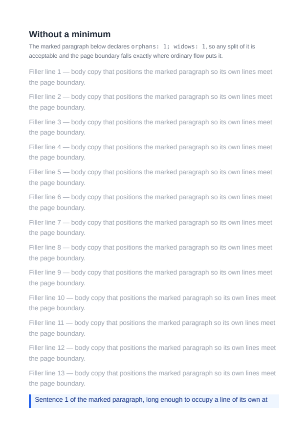
CSS Fragmentation §5.4's line minimums either side of a page break. widows moves the minimum number of lines across the break rather than relocating the whole paragraph; orphans is decided at the break point, so too few lines before it makes the break fall before the paragraph instead.

Keep With Next
CSS Fragmentation §3.1's break-after: avoid, honored even where the heading was placed in a fragmentainer the layout driver had already finished with.
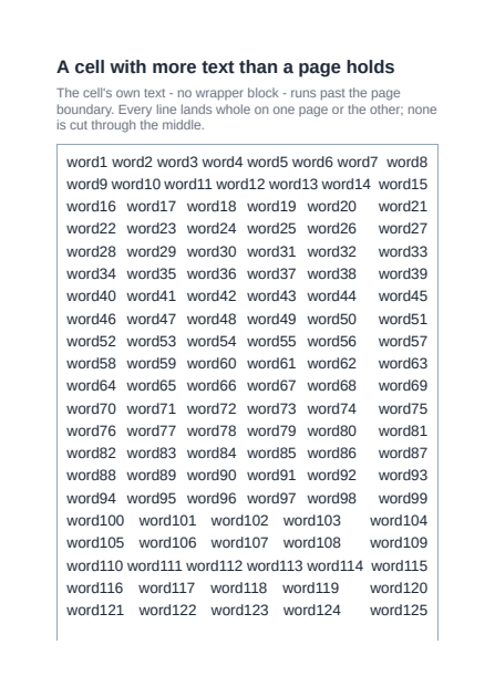
Table Cell Text Across Pages
CSS Fragmentation §4.1: a line box is a monolithic break unit, so a table cell's own text breaks between lines rather than through one.
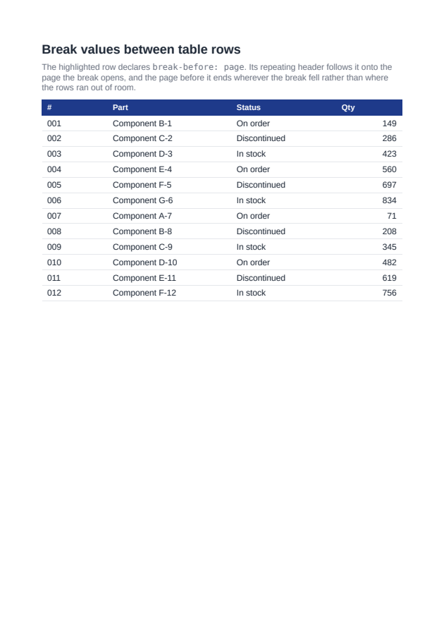
Table Row Break Values
CSS Fragmentation §3.1's forced break values honored at the break point between two table rows, with the table's repeating header carried onto the page the break opens.
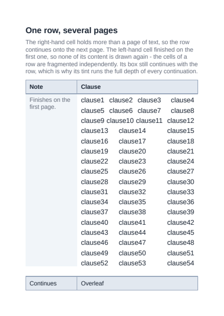
Table Row Continuation
css-tables-3 §6.1: a row whose cell runs out of room continues on the next page, and the cells of that row are fragmented independently - a short cell finishes where it finishes, while its box continues with the row, its tint and borders running the full depth of each continuation with no content in it. The repeating header is carried onto every page the row reaches, above the continuation rather than over it, and the repeating footer closes each of those pages below it - css-tables-3 §6.2's "leave room" applied at both ends of the band.
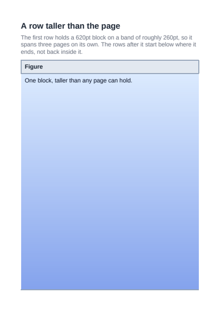
Table Row Taller Than a Page
CSS Fragmentation §4.3: a table row whose cell holds a block taller than the page's content band has no page that could hold it, so it is left where it is and overflows across pages - and the rows after it continue immediately below where it ends, rather than being placed back on a page it is still filling and drawn over its content. The repeating header is carried onto every page the table spans, including the ones the row only overflows through: css-tables-3 6.2 asks for room to be left for it there, and 4.3 allows a UA to slice the graphical representation of content it cannot break, so the block resumes below the header on each page rather than running under it.
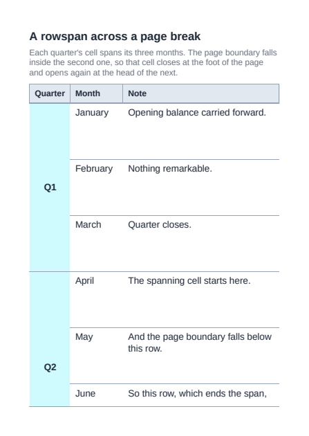
Rowspan Across a Page Break
css-tables-3 §6.1: a cell whose rowspan reaches out of the page it was placed in is fragmented like any other content - its box closes at the foot of that page and continues at the head of the next, its tint and borders running the full depth of each fragment. The row that ends the span is carried onto the next page whole, like any other row, rather than being left straddling the boundary and drawn cut through by it. This is what both other engines do: Gecko re-reflows the spanning cell against the remaining space and continues it, and Blink treats every cell as its own §2.1 parallel flow. Q4 adds the case where the cell's own content, not just its span, overflows the page it opened on: it is fragmented across every page it passes through rather than left stretched from where it opened to where the span ends (issue #521).
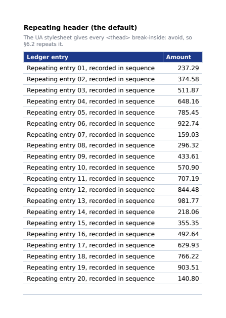
Repeating a Header, or Not
css-tables-3 §6.2 makes repeating a <thead>/<tfoot> conditional: the group repeats only where it carries an avoiding break-inside and where doing so costs under a quarter of the page. The user-agent print stylesheet supplies break-inside: avoid, so repetition is what a table gets by default - and break-inside: auto is the author's way to turn it off, laying the group out once, in flow, and giving the pages after it wholly to the rows.
Layout
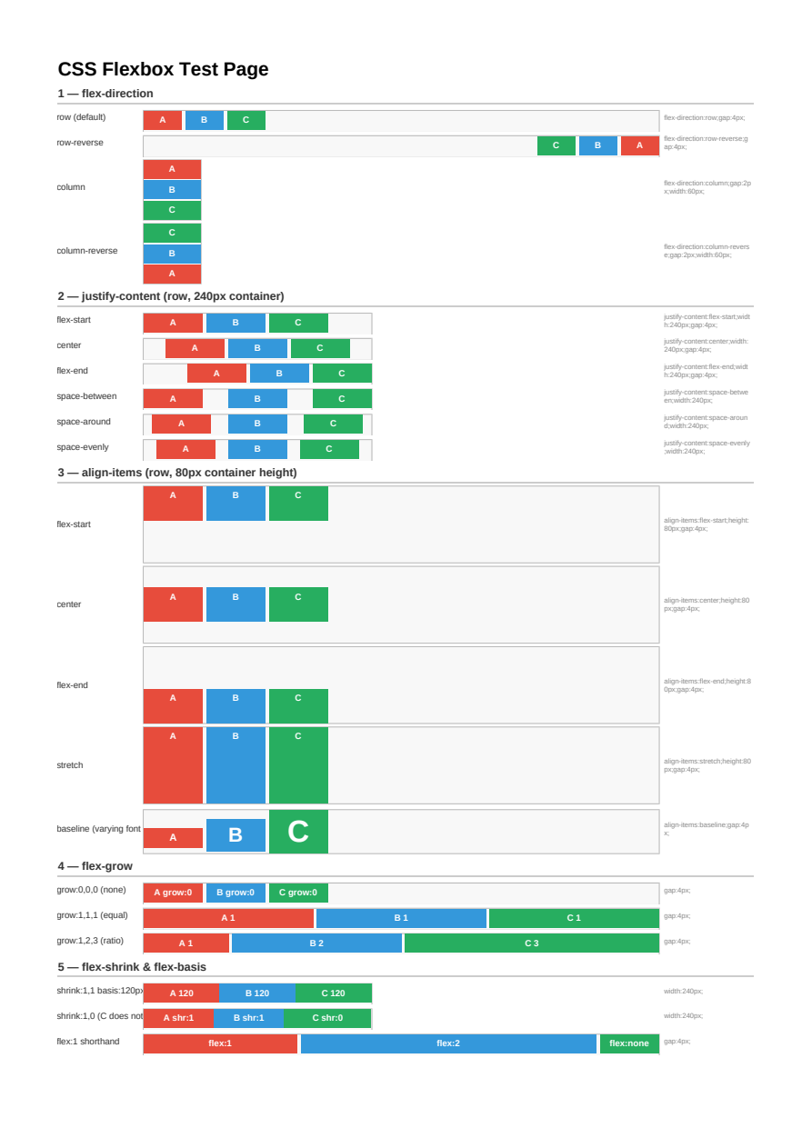
Flexbox
Flexbox layout: direction, wrapping, justification (including start/right and self-start/self-end), alignment, gaps, flexible item sizing, and replaced elements (img/svg) as flex items.
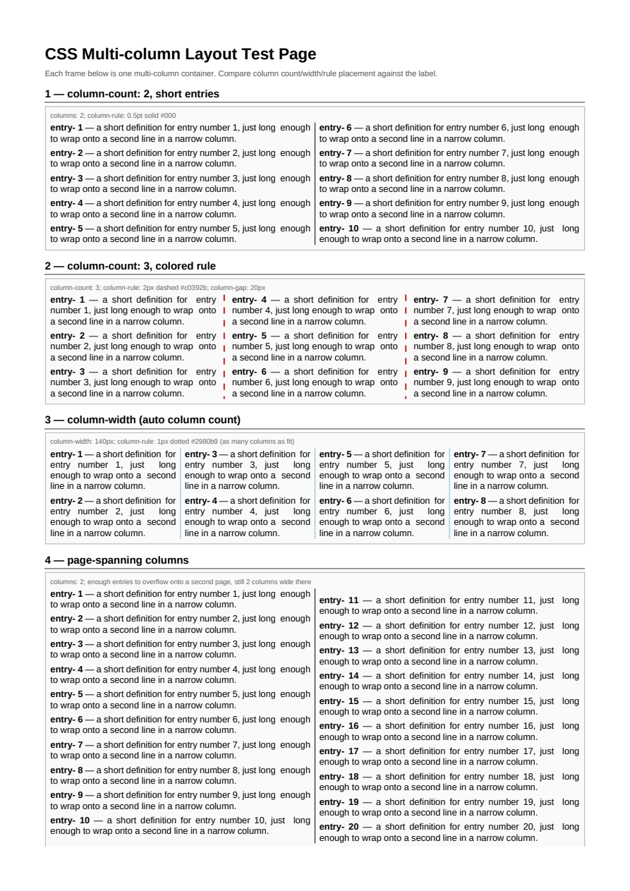
Multi-column Layout
CSS multi-column layout: column counts, widths, gaps, and column rules.
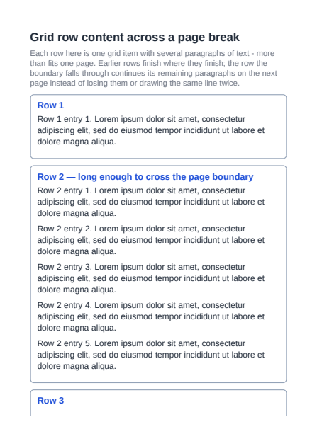
Grid Item Content Across Pages
A grid row's own content now fragments across a page break instead of being lost or duplicated: CssLayoutEngineGrid's commit pass lays each row's items out for real once they sit at their final position, live against the fragmentainer they land in - the same content-fragmentation guarantee flex and ordinary block flow already had (issues #517/#526).
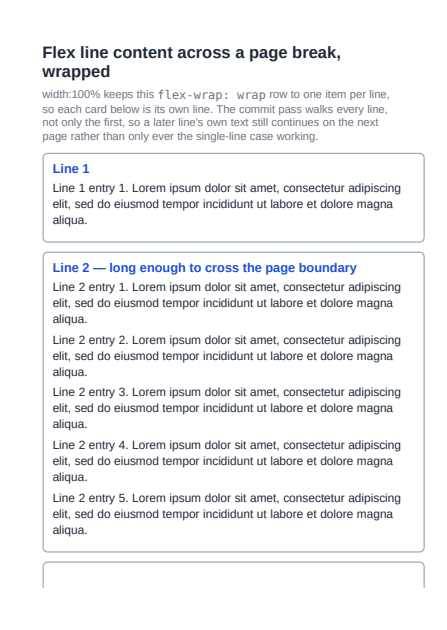
Flex Line Content Across Pages
A wrapped flex row container's own item content now fragments across a page break for every line, not only a single-line container: CssLayoutEngineFlex's commit pass walks every line in one pass, committing as many as fit before a later line's content continues on the next page (issues #517/#526).
Flex Column Item Content Across Pages
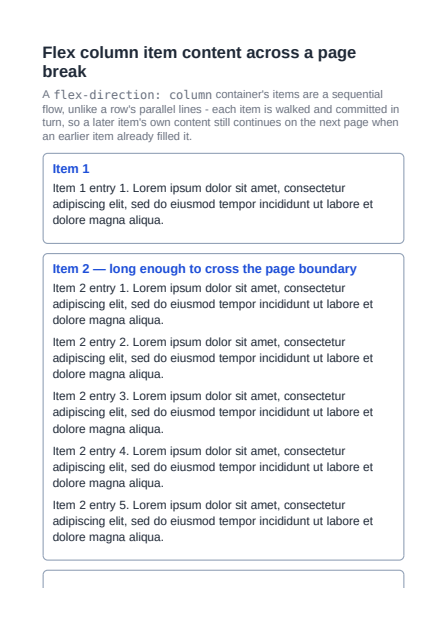
A flex-direction:column container's items are a sequential flow, and each one's own content now fragments across a page break the same way a row-direction line's items already did: CssLayoutEngineFlex walks a column-direction line's items in turn, committing each one's content live and continuing a later item's remaining content on the next page (issues #517/#526).
Break Points Between Column Flex Items
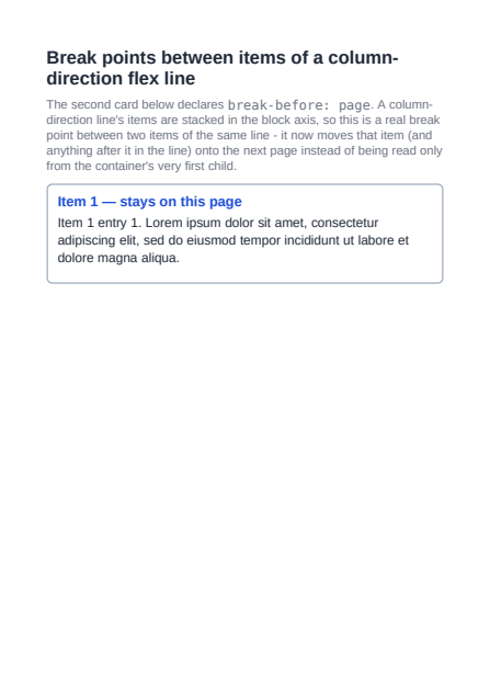
A break-before/break-after/break-inside:avoid value between two items of the same flex-direction:column line is now honored, moving just that item (and whatever follows it in the line) rather than being read only from the container's own first child - each line of a wrapping column container relocates independently of the others (issue #455).
Flex Item Background Past Its Pinned Height
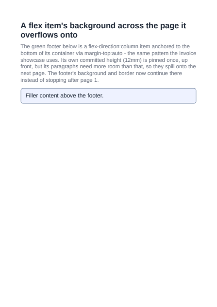
A flex-direction:column item whose own content is entirely block-level children (no direct text on the item itself) and whose committed content-box size falls short of what it actually holds now keeps its background and border on every page its content spills onto, not only the first - FragmentEmitter.BuildDraft previously had a decoration rectangle only for a box with no content at all in a fragmentainer (a pure continuation shell) or one whose own bounds already reached it, missing the case where a page-grid box's item-content-commit-pinned bounds fall short of the children it genuinely holds there (issue #569).
aspect-ratio
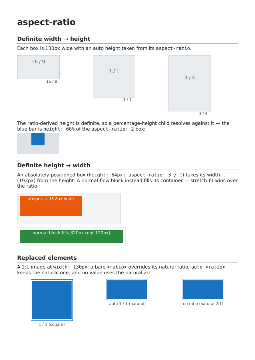
CSS aspect-ratio in both directions: width→height (with a percentage-height child resolving against the ratio-derived height) and height→width for shrink-to-fit boxes, replaced-element natural ratio vs. a specified/auto ratio, and indefinite-percentage-height sizing.
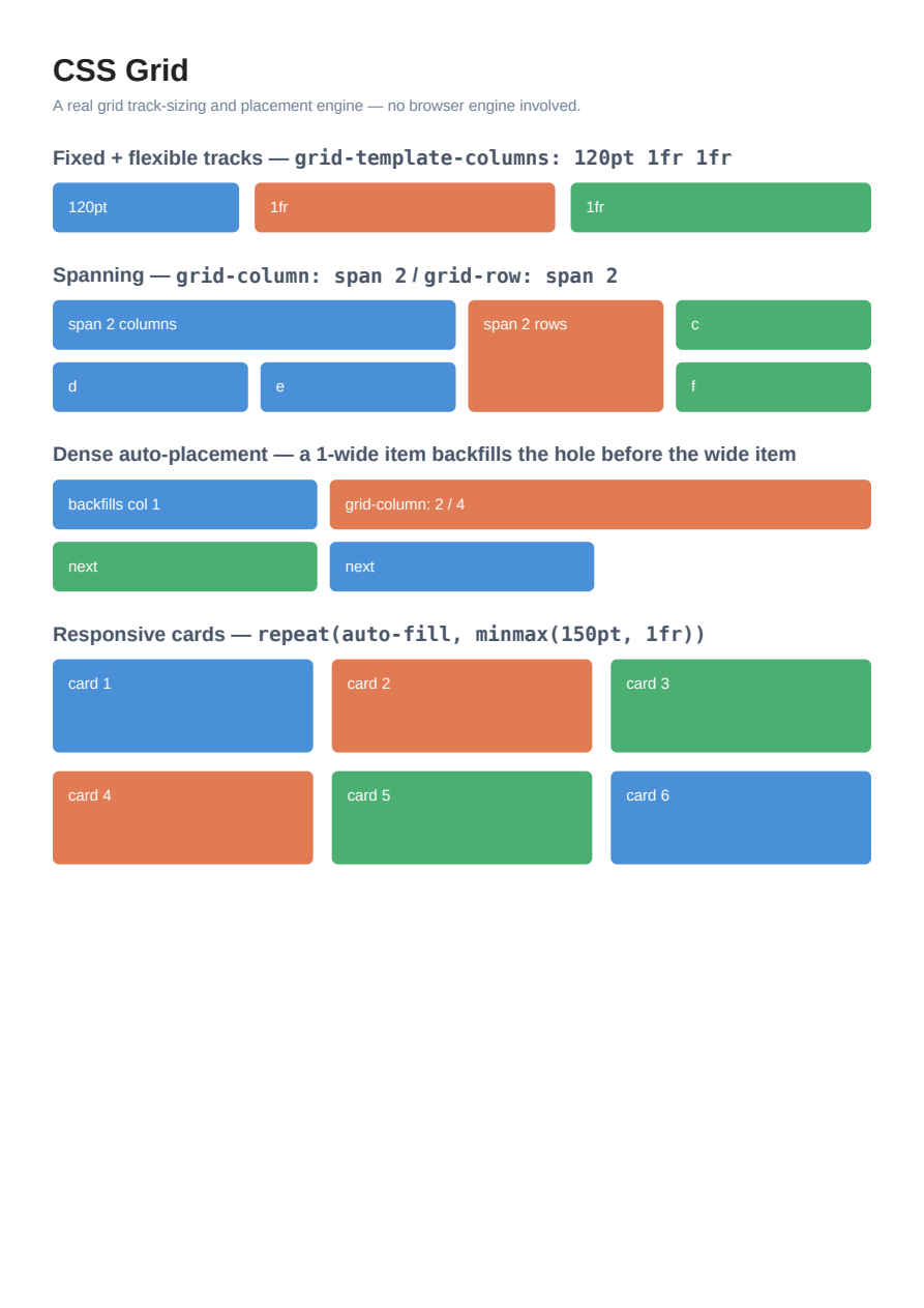
CSS Grid
CSS Grid layout: fixed and `fr` tracks, item spanning (`grid-column: span 2`, `grid-row: span 2`), dense auto-placement backfilling a hole, and the responsive `repeat(auto-fill, minmax(150pt, 1fr))` card idiom — all laid out by PeachPDF's own grid track-sizing and placement engine.
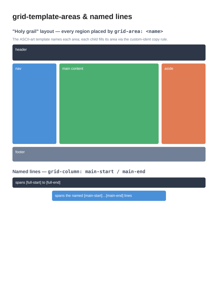
CSS Grid Template Areas
CSS `grid-template-areas`: a classic "holy grail" page layout where each region places itself with `grid-area: <name>`, plus named grid lines (`[main-start]`) referenced from `grid-column` — the named placement model of PeachPDF's grid engine.
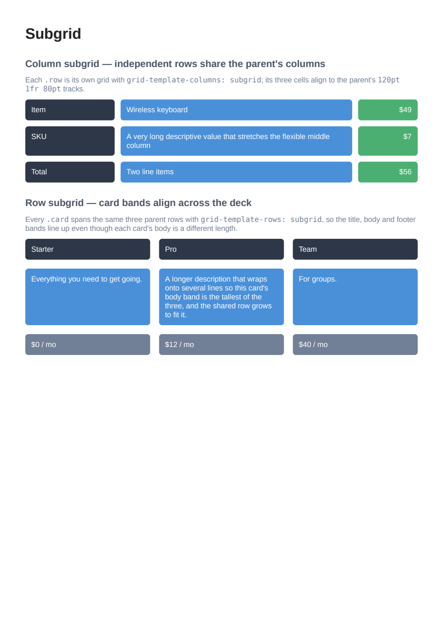
CSS Grid Subgrid
CSS Grid Level 2 `subgrid`: independent rows adopting the parent's columns (`grid-template-columns: subgrid`) so their cells align, and a card deck adopting the parent's rows (`grid-template-rows: subgrid`) so title/body/footer bands line up across cards — the nested grid adopts its parent's tracks.
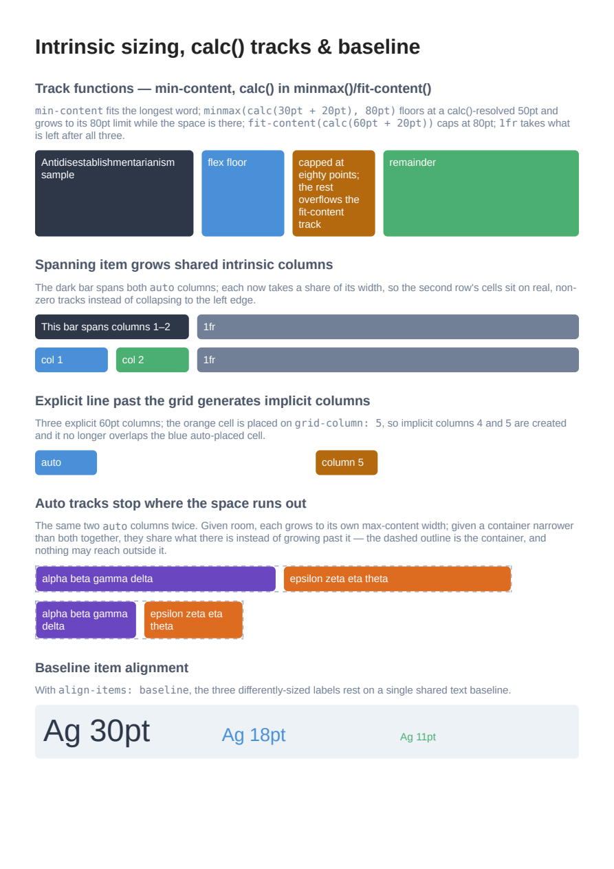
CSS Grid Intrinsic Sizing & Baseline
CSS Grid sizing/placement depth: `min-content` vs `max-content` tracks, `calc()` inside `minmax()`/`fit-content()`, a spanning item growing the shared intrinsic columns it covers, an explicit line past the grid generating implicit columns, `auto` tracks stopping at the container rather than overflowing it, and `align-items: baseline` sharing one text baseline.
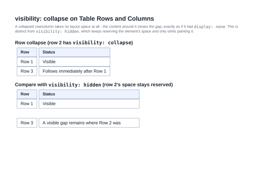
Table Row/Column Collapse
visibility: collapse on table rows, row-groups, columns, and column-groups (CSS 2.1 §17.6.1): the collapsed row/column takes no layout space and its neighbors shift in to close the gap, unlike visibility: hidden which still reserves the space.
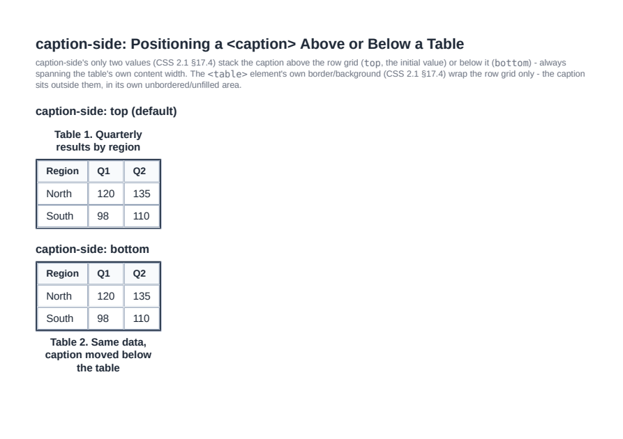
Table Captions (caption-side)
caption-side: top (the initial value) and bottom (CSS 2.1 §17.4), stacking a <table>'s <caption> above or below its row grid and stretching it to the table's own content width, with the <table>'s own border/background wrapping the row grid only.
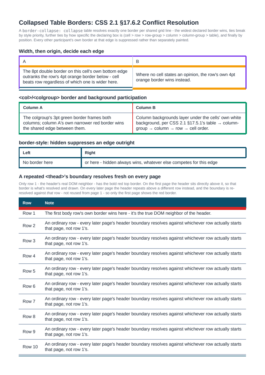
Collapsed Table Border Resolution
CSS 2.1 §17.6.2's full border-conflict resolution for border-collapse: collapse - width, then style priority, then cell/row/row-group/column/column-group/table origin, then position - plus <col>/<colgroup> border/background participation and a repeated <thead> whose boundary to the body re-resolves correctly on every page (issue #735).
CSS Values & Functions
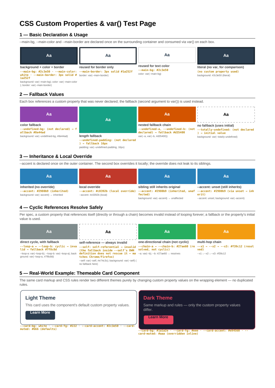
Custom Properties
CSS custom properties resolved through var(), including fallbacks and cascading overrides.
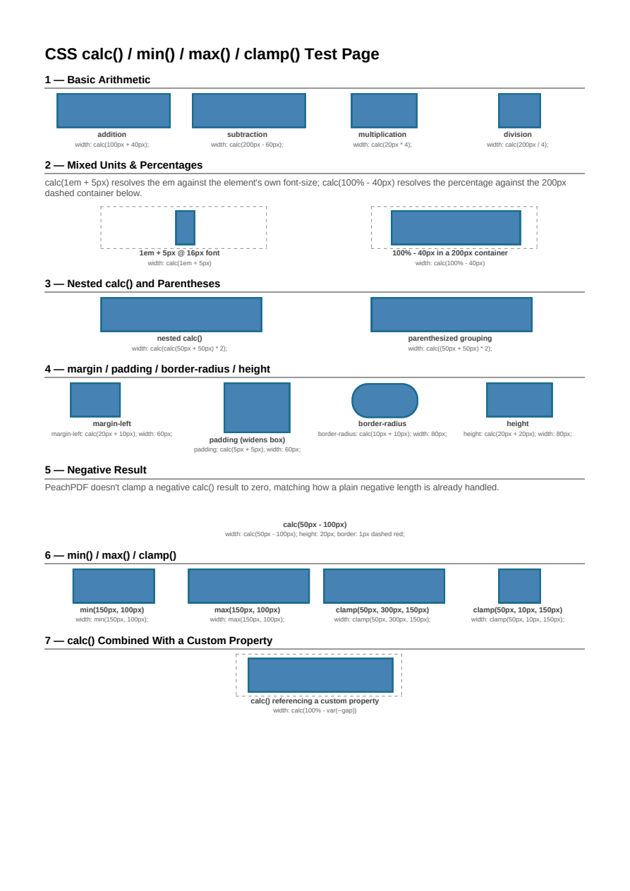
calc() & Math Functions
calc(), min(), max(), and clamp() expressions resolving against real box dimensions.
Graphics & Effects
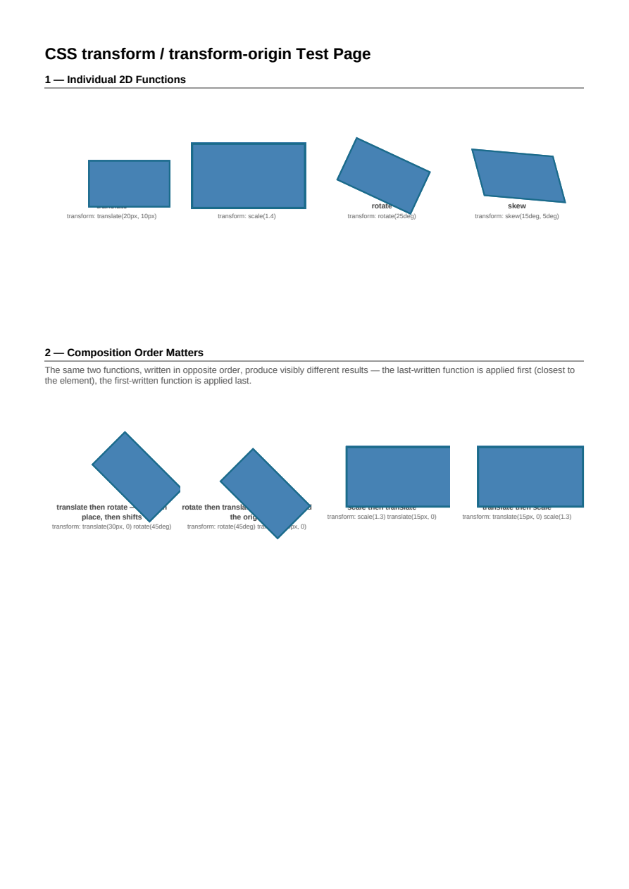
Transforms
CSS transforms - translate, rotate, scale, skew - with transform-origin control.
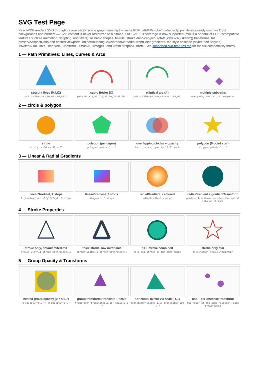
SVG
Inline and embedded SVG rendered as true vector PDF content: shapes, paths, gradients, patterns, masks, and text.
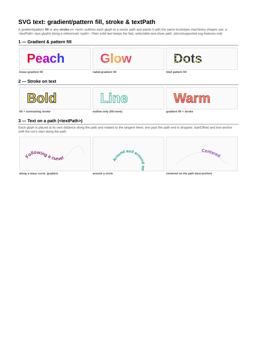
SVG Text: Gradient, Stroke & Path
SVG text with gradient/pattern fill, stroke, and glyphs laid along a path (textPath) - all rendered as real vector PDF content.
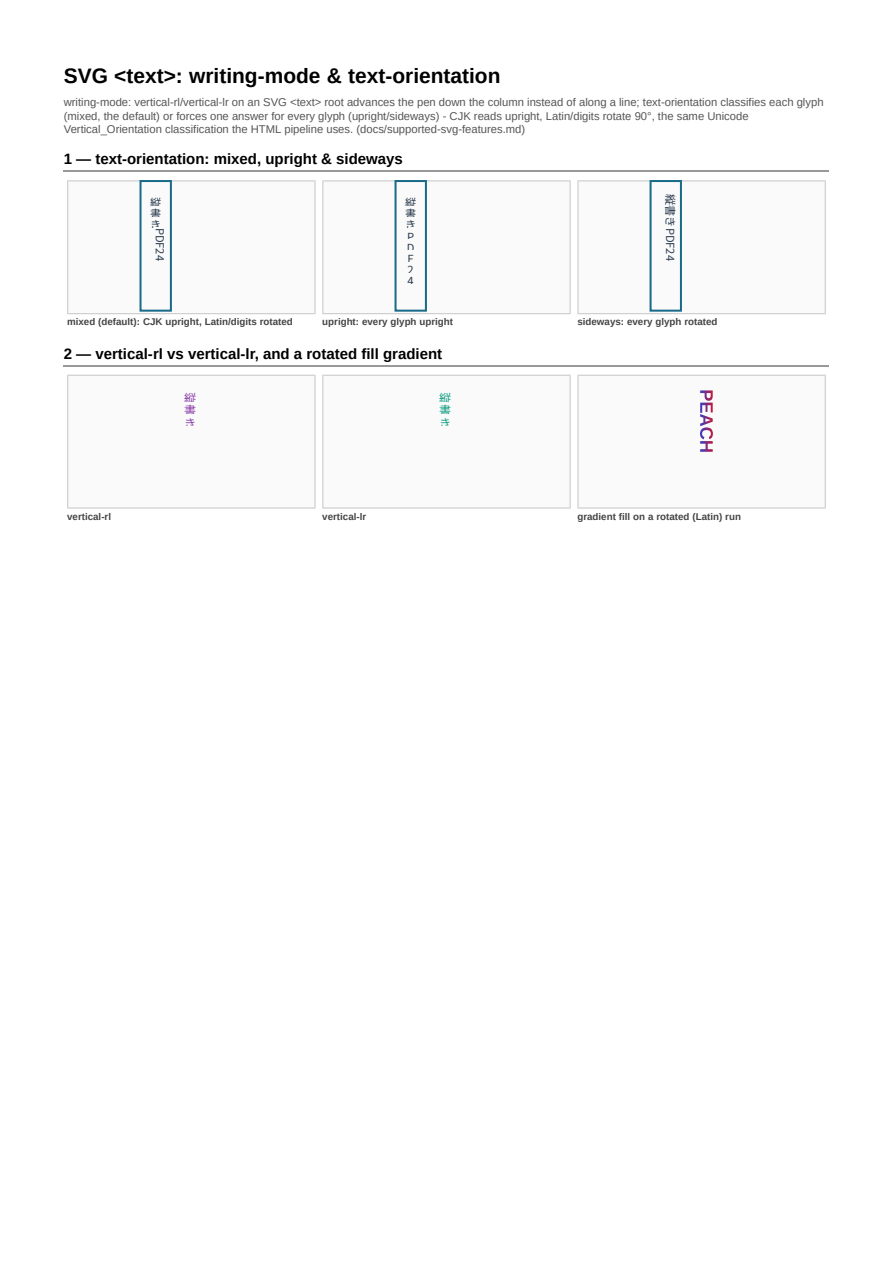
SVG Text: Vertical Writing Mode
SVG <text> under writing-mode: vertical-rl/vertical-lr with real per-character text-orientation (issue #765's SVG counterpart) - CJK glyphs upright, Latin/digits rotated, composing with gradient fill.
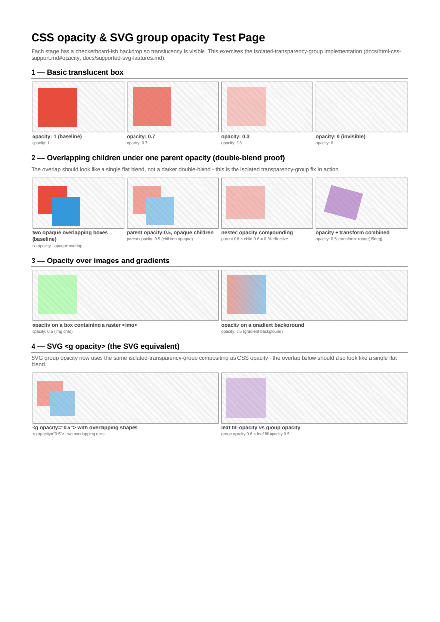
Opacity
Element opacity composited as real group transparency over text, images, and nested content.
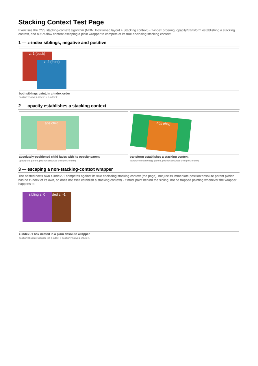
Stacking Contexts
z-index and stacking contexts: paint order across positioned, floated, and transformed boxes.
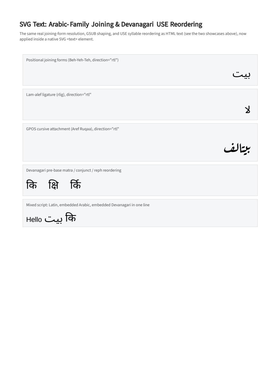
SVG Text: Arabic-Family Joining & Devanagari USE
Native SVG <text>/<tspan> content shaped with the same real per-character joining-form resolution, GSUB substitution (including a font's own rlig lam-alef ligature and GPOS cursive attachment), and Devanagari USE syllable reordering HTML text already had - previously SVG rendered this text as isolated, unjoined, unreordered nominal glyphs only.
Typography & Text
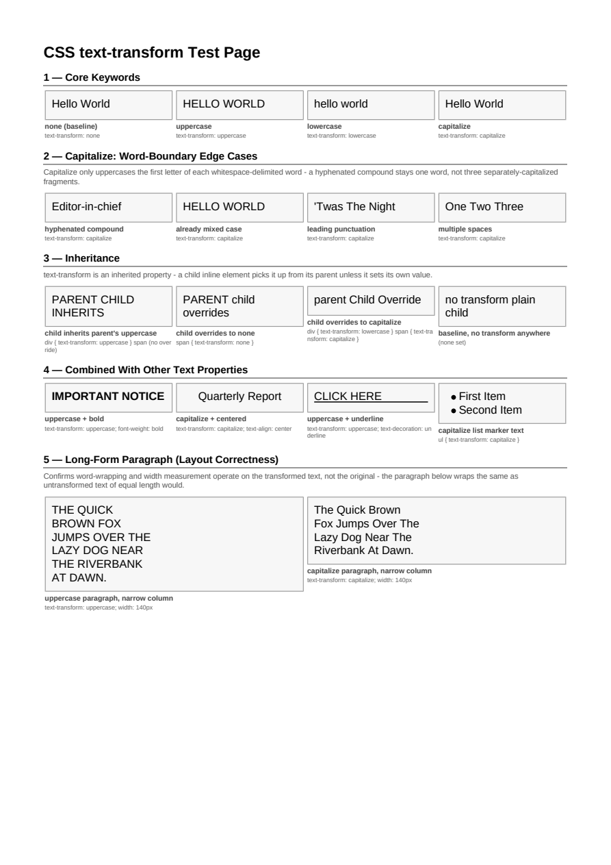
text-transform
text-transform variants - uppercase, lowercase, capitalize - applied at render time.
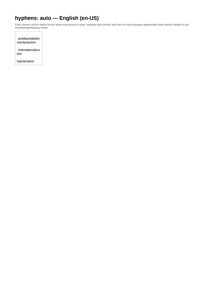
Hyphenation — English (en-US)
Automatic hyphenation (hyphens: auto) splitting long words at real, language-appropriate break points in a narrow justified column.
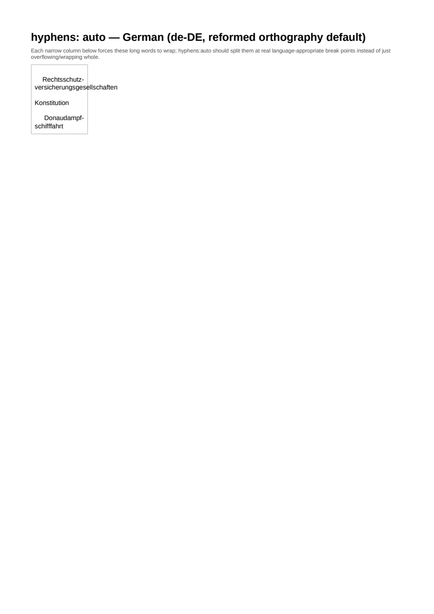
Hyphenation — German (de-DE, reformed orthography default)
Automatic hyphenation (hyphens: auto) splitting long words at real, language-appropriate break points in a narrow justified column.
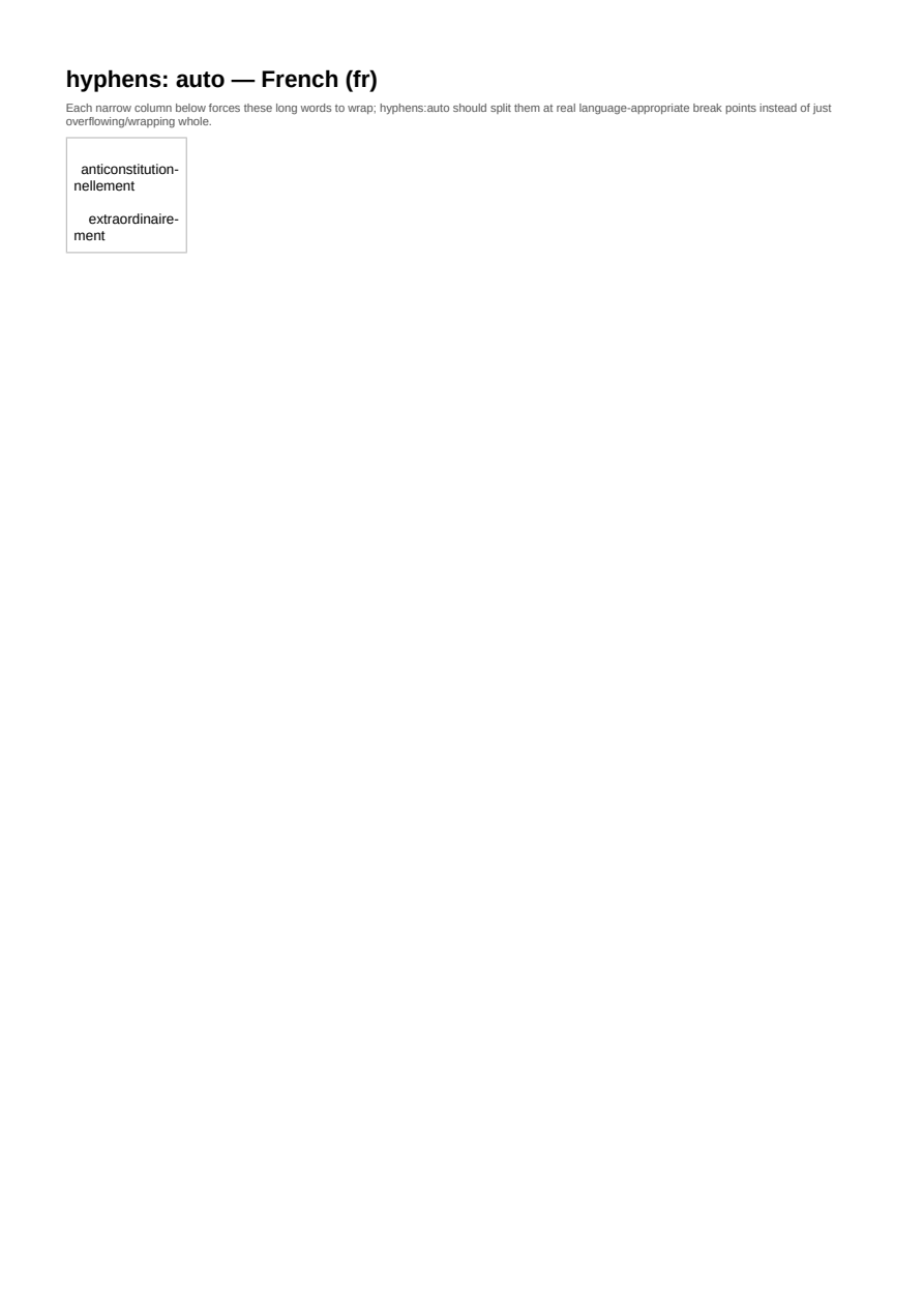
Hyphenation — French (fr)
Automatic hyphenation (hyphens: auto) splitting long words at real, language-appropriate break points in a narrow justified column.
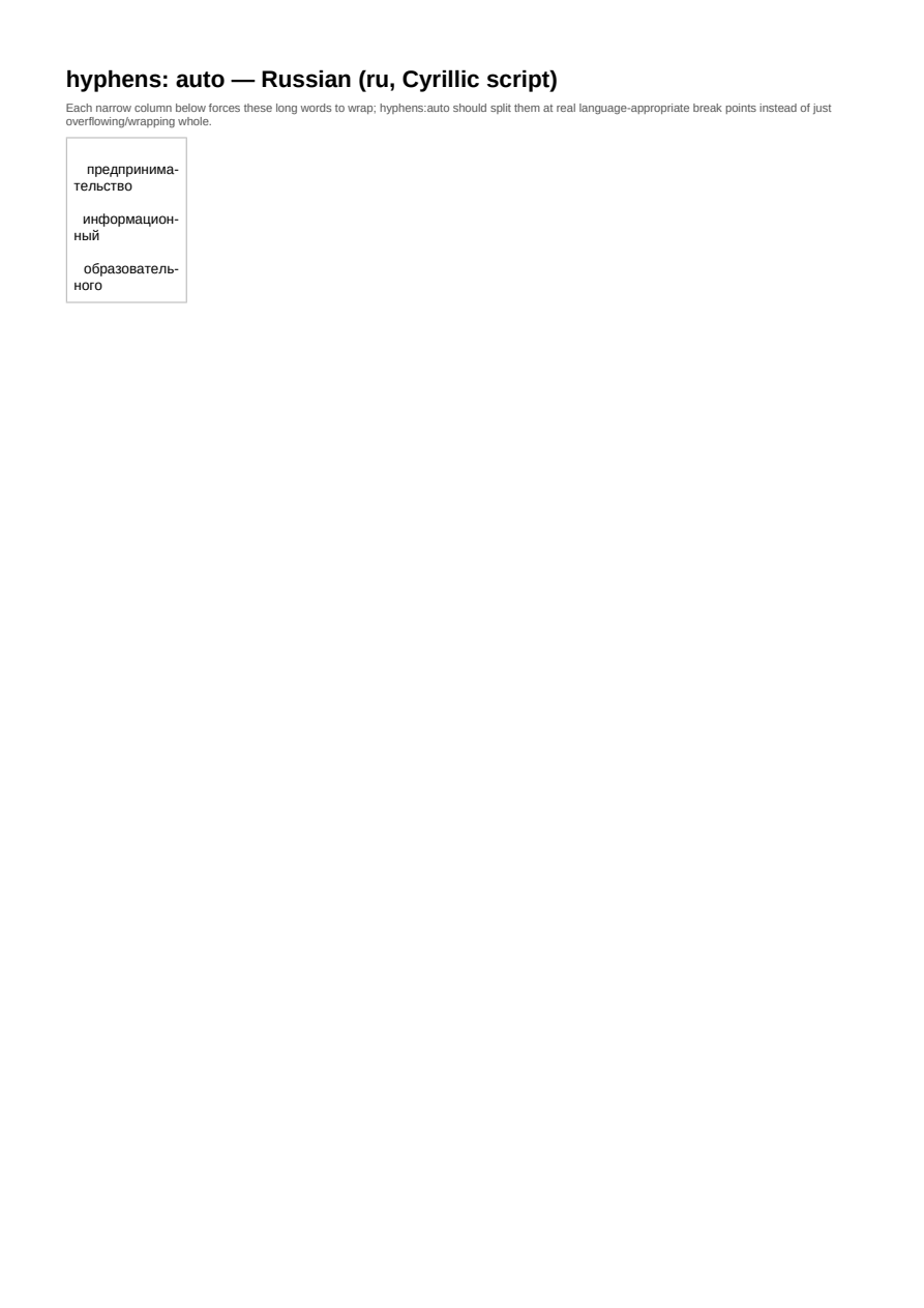
Hyphenation — Russian (ru, Cyrillic script)
Automatic hyphenation (hyphens: auto) splitting long words at real, language-appropriate break points in a narrow justified column.
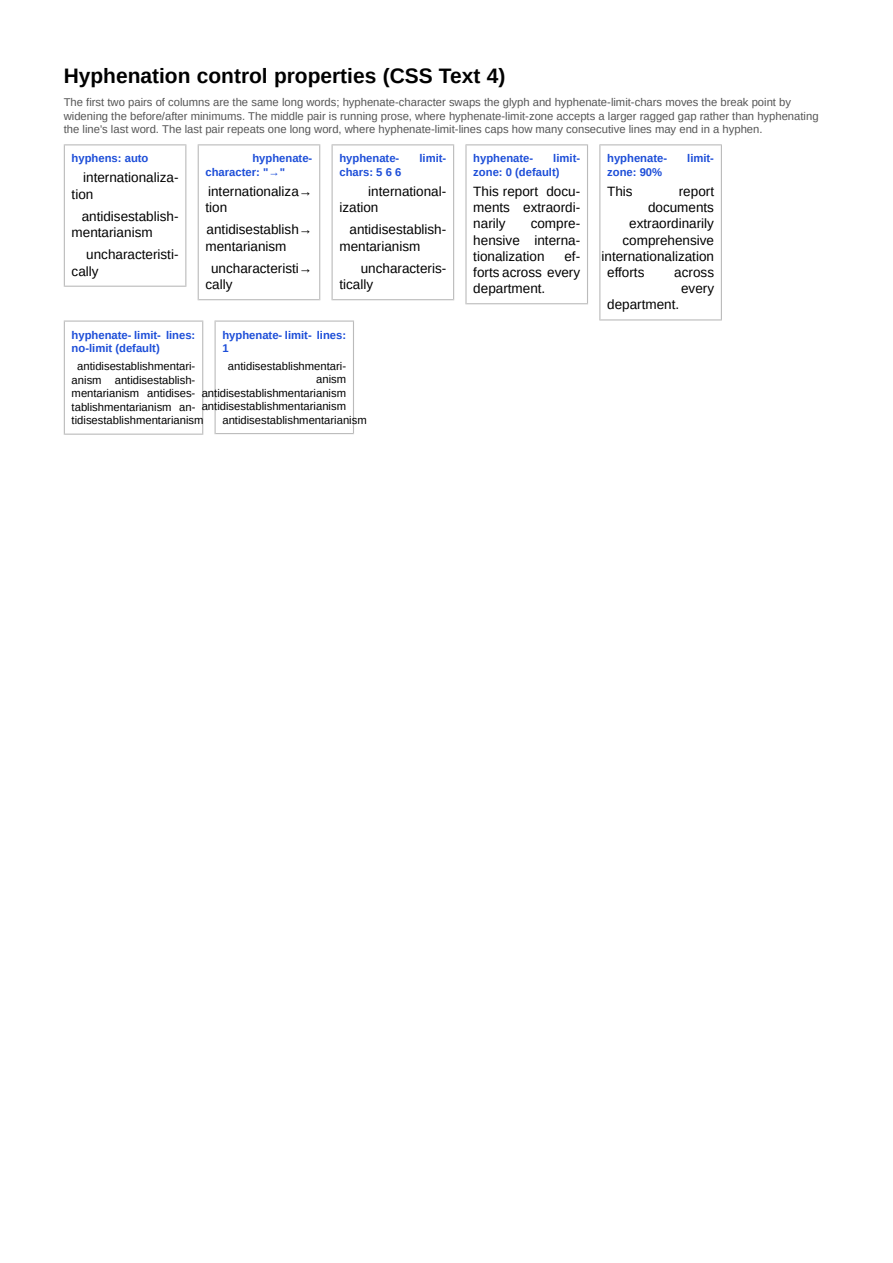
Hyphenation Control Properties
CSS Text 4's hyphenate-character, hyphenate-limit-chars, hyphenate-limit-zone and hyphenate-limit-lines shown side by side against default hyphens:auto behavior: a custom hyphen glyph, wider before/after character minimums moving where a word breaks, a wide limit-zone accepting a larger ragged gap at a line's end rather than hyphenating its last word, and a limit-lines of 1 stopping two hyphenated lines in a row (issue #713).
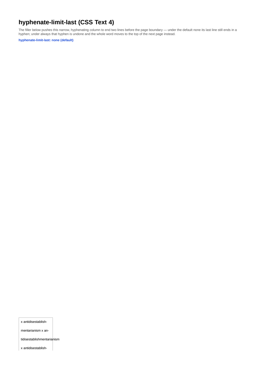
hyphenate-limit-last
CSS Text 4's hyphenate-limit-last preventing a hyphen from ending the last line before a page break: the default none lets it hyphenate right up to the boundary, always moves the whole word onto the following page instead.
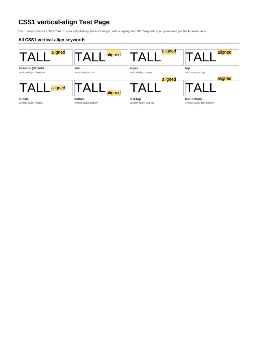
Vertical Align
vertical-align behaviors for inline content, from baseline and middle to explicit offsets, including its length and percentage forms.
Letter & Word Spacing
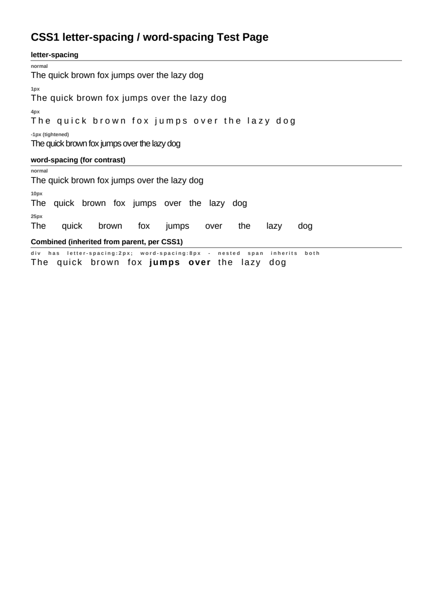
letter-spacing and word-spacing adjustments across text runs.
tab-size
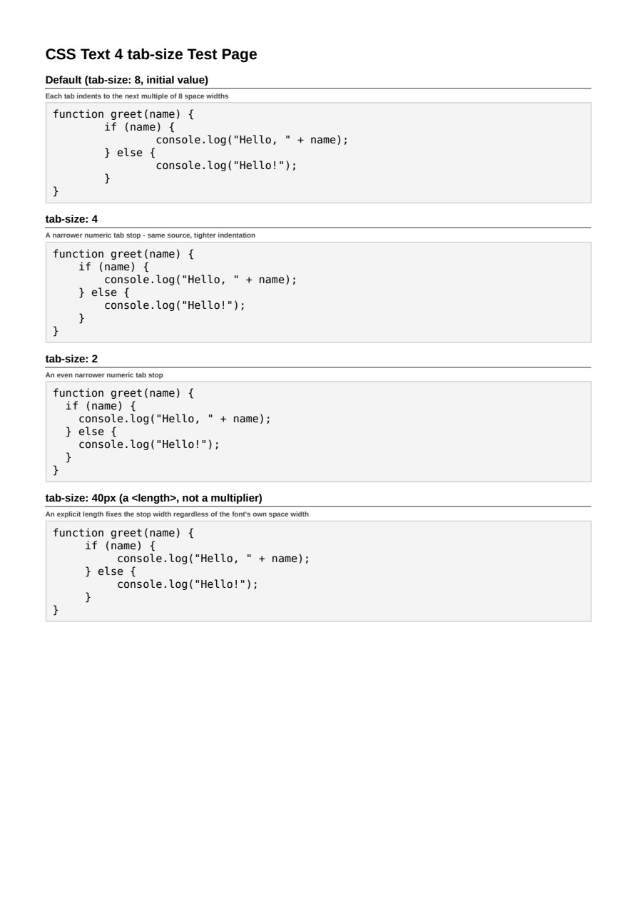
tab-size (CSS Text 4): controlling how far a preserved tab character indents inside white-space:pre content.
::first-letter
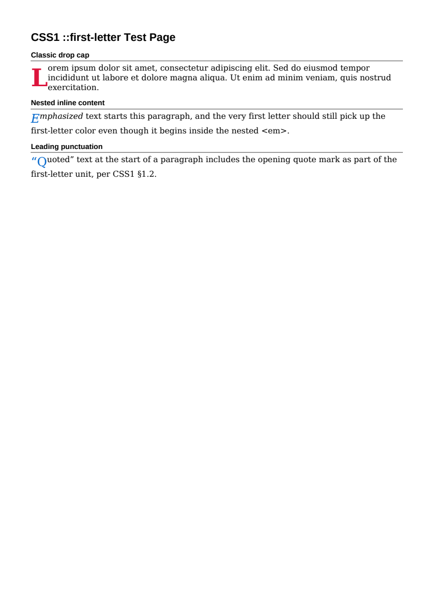
The ::first-letter pseudo-element: drop-cap style initial letter formatting.
::first-line
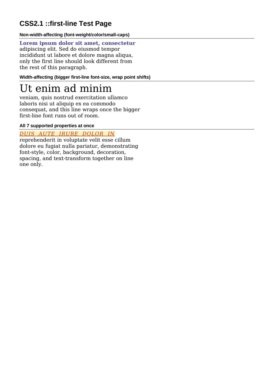
The ::first-line pseudo-element styling the first rendered line of a paragraph.
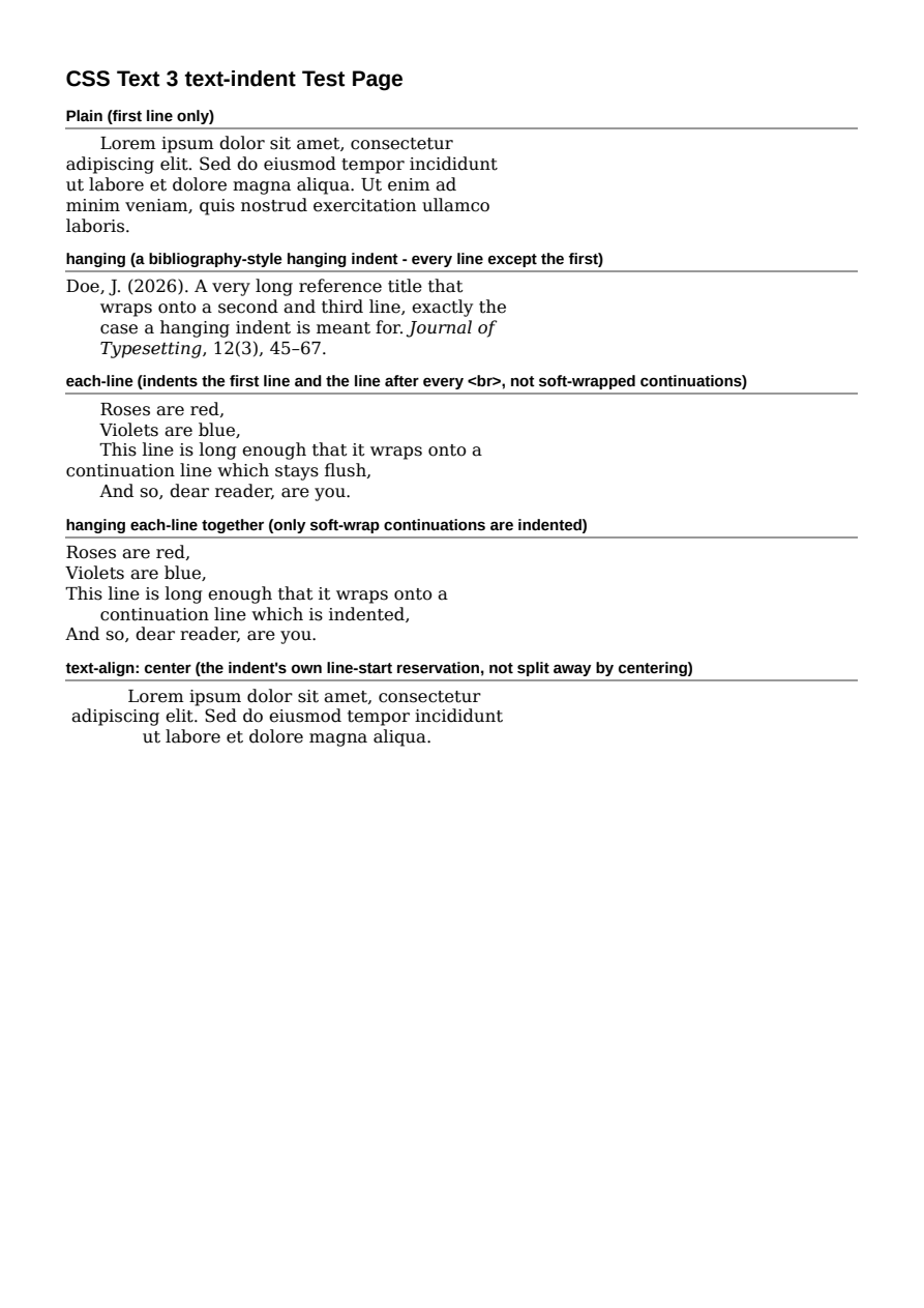
text-indent
text-indent's plain, hanging, and each-line forms (CSS Text 3), including their combination and interaction with text-align: center.
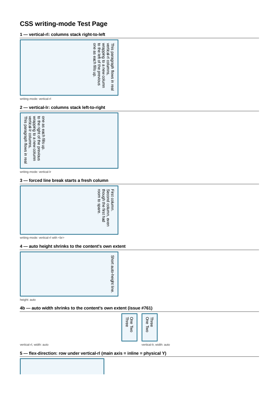
writing-mode (Vertical Text)
Real vertical-rl/vertical-lr line flow: columns stacking along the block axis, text running top-to-bottom within each column, real per-character text-orientation (upright CJK next to rotated Latin), writing-mode-aware Flexbox and Table layout (including captions, thead/tfoot, collapsed borders, vertical-align and rowspan row-axis sizing), block-level/orthogonal-flow content inside a vertical box, direction: rtl block children anchoring to the physical bottom edge, real CSS2.1 margin collapse (sibling-to-sibling and box-own-edge) between block-axis-stacked children, and (issue #768) text-align, Unicode Bidi Algorithm reordering, hyphenation, position: absolute/fixed, and float column wrap-around all working inside vertical line flow.
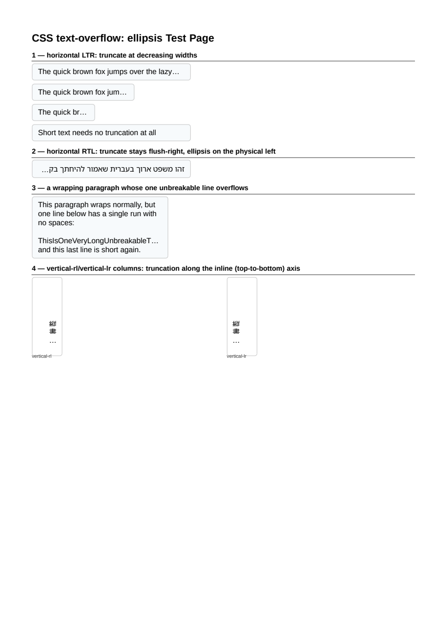
text-overflow: ellipsis
Per-line-box truncation with a trailing ellipsis wherever content overflows an overflow:hidden container's content edge - Tailwind's truncate idiom for the common single nowrap line, a wrapping paragraph whose one unbreakable line overflows, and both horizontal directions plus vertical-rl/vertical-lr writing modes, each finding the correct end edge (right/left/bottom/top) for its own writing-mode/direction combination.
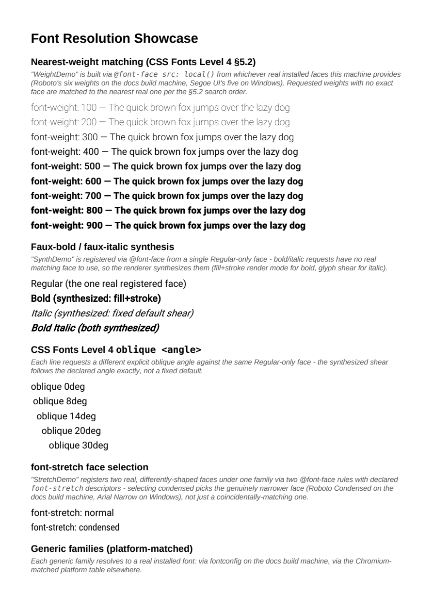
Font Resolution
CSS font selection compliance: nearest-weight matching across a six-weight family, faux-bold/italic synthesis, oblique angles, font-stretch face selection, and generic family resolution.
Standards & Accessibility
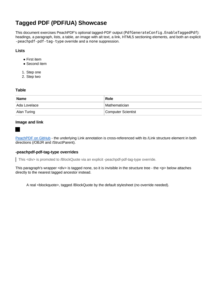
Tagged PDF (PDF/UA)
Accessible, tagged PDF output: a logical structure tree with headings, lists, tables, alt text, links, and tag-type overrides.

PDF/A Conformance
Archival PDF/A output: an embedded sRGB ICC output intent, XMP metadata with pdfaid:part/conformance, and (at the accessible "A" level shown here) a tagged structure tree.

PDF Bookmarks (Outline)
Automatic PDF outline generation from headings, with full CSS control via bookmark-level/bookmark-label/bookmark-state and -peachpdf-bookmark-target.
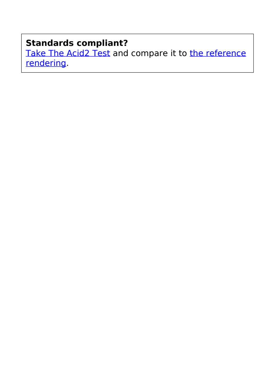
Acid2
The unmodified Acid2 test rendered by PeachPDF - the classic CSS compliance smiley.
Real-World Documents
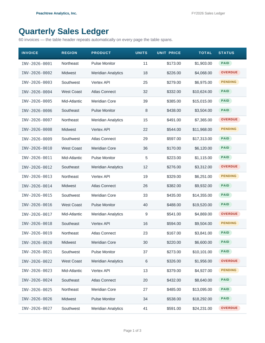
Repeating Table Headers
A 60-row sales ledger spanning three pages - the table header repeats automatically on every page, framed by @page margin-box running headers and page counters.
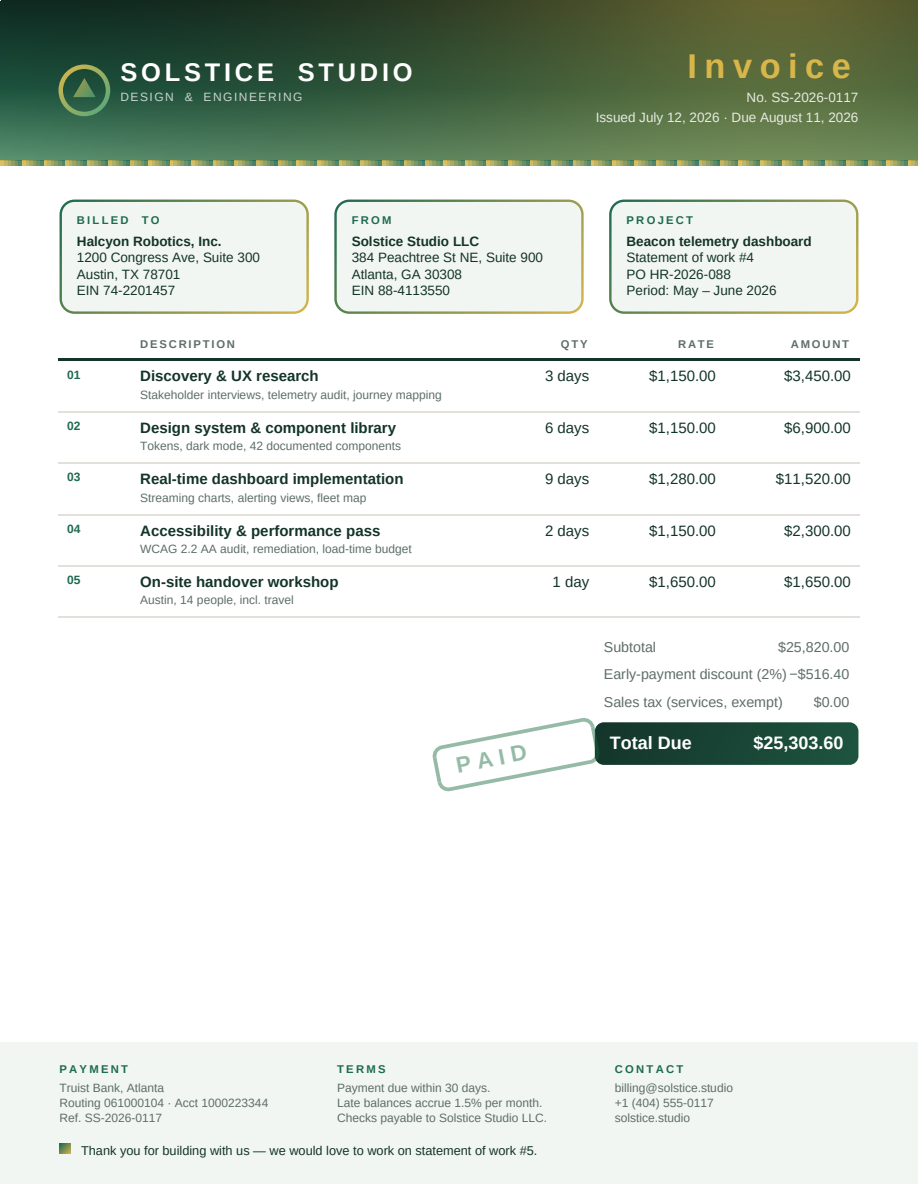
Modern Invoice
A one-page, full-bleed invoice in a dark green palette: custom properties, oklch gradient interpolation, gradient-border cards, zero-padded line numbers via counter(line, decimal-leading-zero), a transform stamp, and an inline SVG logo.

Print Catalog
A ten-page furniture catalog designed as a book: true four-edge full-bleed gradient cover via @page :first { margin: 0 }, per-item SVG art, string-set running headers, a margin-box image logo, and mirrored gutter folios via :left/:right page selectors.
Fonts & Text

@font-face unicode-range
Per-character font matching: a monospaced webfont declared only for the digit range (U+0030-0039) supplies the digits, while letters in the same text run fall back to serif - each character resolved to the family whose unicode-range (or glyph coverage) covers it.
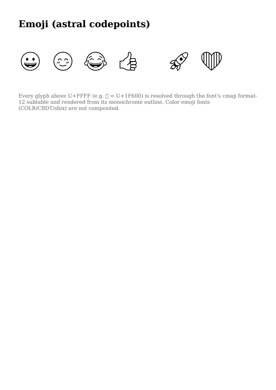
Emoji (astral codepoints)
Supplementary-plane (astral, U+FFFF+) glyph rendering: emoji resolve through the font's cmap format-12 subtable and render as monochrome outlines from a bundled subset of Noto Emoji. Color-glyph tables (COLR/CBDT/sbix) are not composited.
Charts & Data Viz
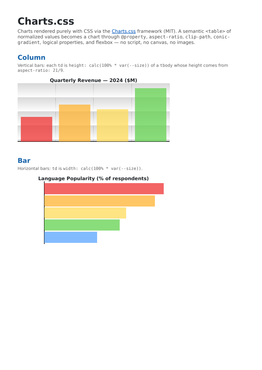
Charts.css
The Charts.css framework (MIT) rendering column, bar, area, line, and pie charts — plus a multi-series example and the documented customizations (extruded 3D bars via stacked box-shadows, a skewY tilt, and shadowed bars with inset+outset box-shadow) — purely from CSS. The full official stylesheet is embedded, exercising @property, aspect-ratio, clip-path, box-shadow, logical properties, and conic/linear gradients together.
Images & Replaced Content
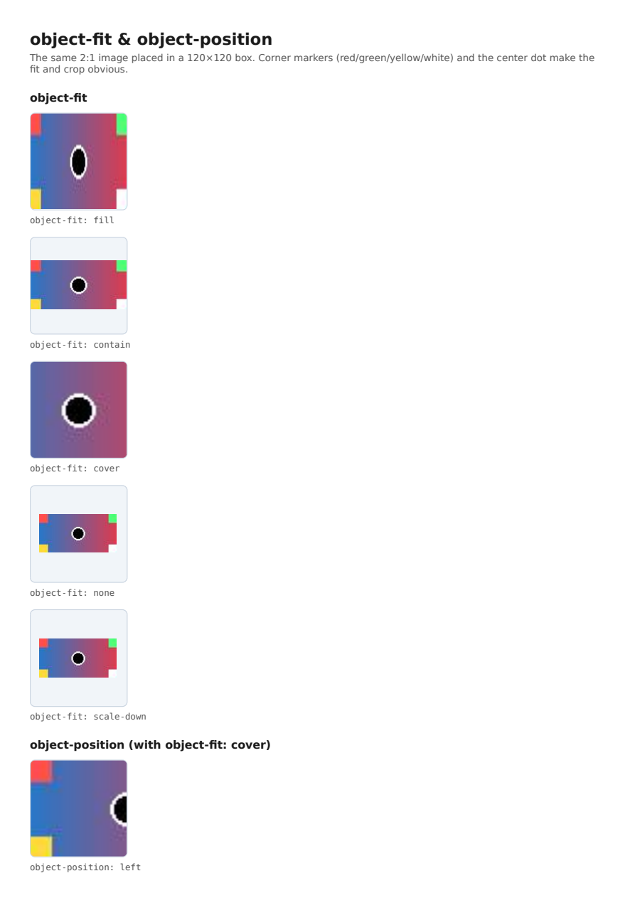
object-fit & object-position
The CSS object-fit (fill/contain/cover/none/scale-down) and object-position properties applied to a replaced <img>: the same 2:1 image sized/cropped/positioned inside a fixed square box, with corner markers making each fit and crop obvious.
Color
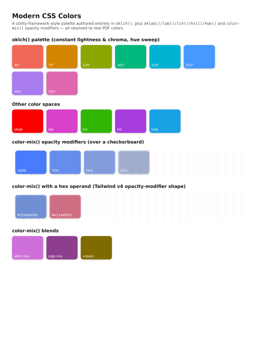
Modern CSS Colors (oklch, color-mix)
A wide-gamut palette authored in oklch() with oklab()/lab()/lch()/hsl()/hwb() companions, plus color-mix() opacity modifiers (including hex operands of either form) and blends composited over a checkerboard — the CSS Color 4/5 function set modern utility frameworks emit, resolved to real PDF colors.
Selectors & Cascade
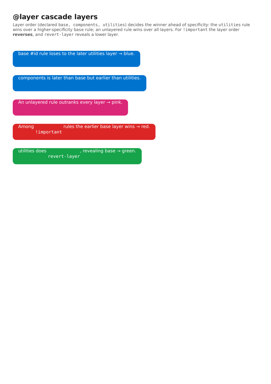
@layer Cascade Layers
CSS cascade layers: an @layer order declaration makes a later layer's low-specificity rule win over an earlier layer's high-specificity (#id) rule, and an unlayered rule beat every layer; for !important the layer order reverses (earlier layer wins), and revert-layer reveals a lower layer — the layering model modern utility frameworks rely on.
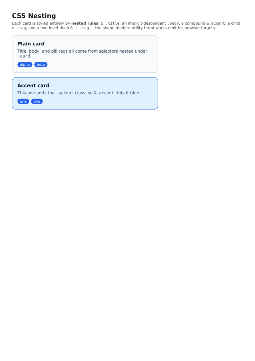
CSS Nesting
CSS Nesting: a card styled entirely by rules nested inside `.card` — the `&` nesting selector (`&.accent`), an implicit-descendant nested selector (`.body`), a child combinator (`> .tag`), and a two-level-deep nested combinator (`& + .tag`), resolved against the parent exactly like `:is(.card)`.
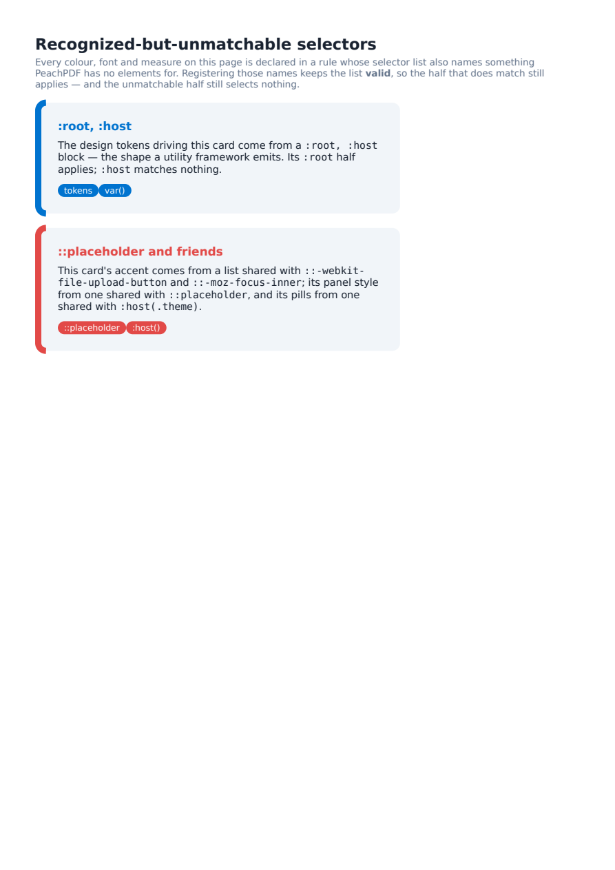
Unmatchable Selectors
Selectors PeachPDF recognizes but can never match — `:host`, `:host()`, `::placeholder`, and vendor extensions like `::-webkit-file-upload-button` — no longer invalidate the selector list they share with a real selector. Every token, colour and measure here arrives through such a list, including a Tailwind-v4-shaped `:root, :host` design-token block.
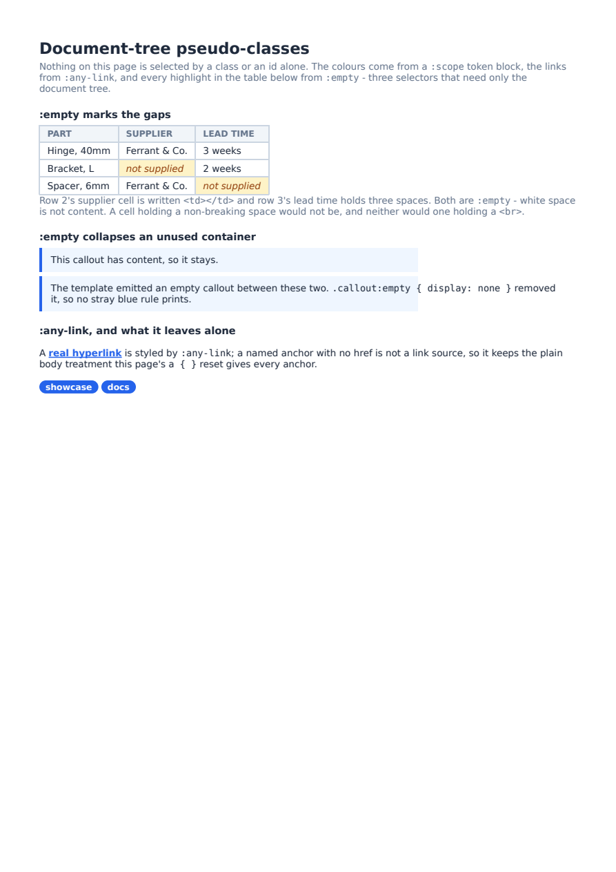
Document-Tree Pseudo-Classes
`:empty`, `:any-link` and `:scope` — the three pseudo-classes that depend only on the document tree, so a static renderer can evaluate them. The design tokens here come from a `:scope` block, the link styling from `:any-link`, and the table's flagged gaps plus the collapsed callout from `:empty` (which counts white space as no content, and ignores generated `::before`/`::after` boxes entirely).
Responsive Design
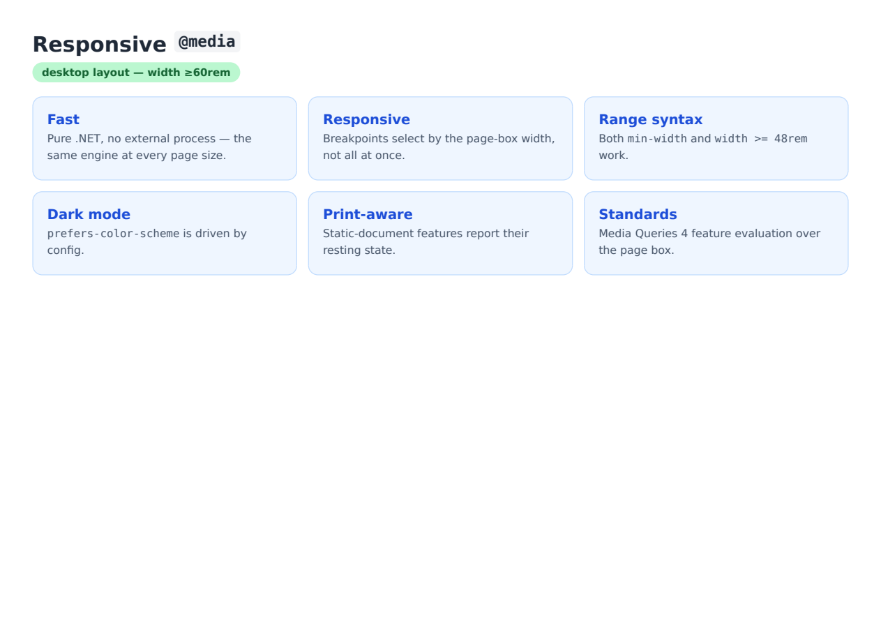
Responsive @media (wide page)
A mobile-first stylesheet rendered on a wide (A4 landscape) page: the `@media (min-width: 60rem)` breakpoint matches the page-box width, so the grid becomes three columns and the badge flips to "desktop".
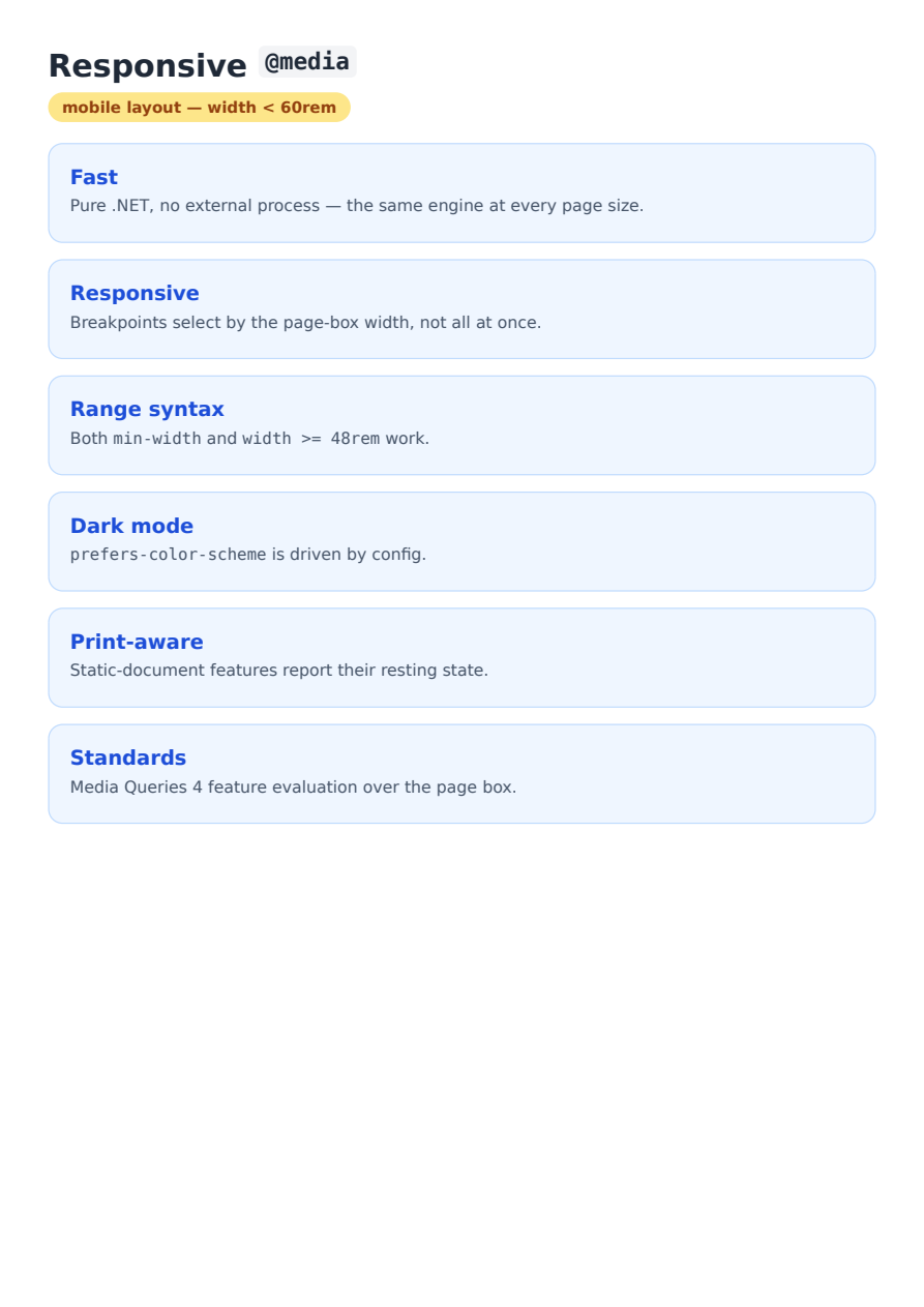
Responsive @media (narrow page)
The identical stylesheet rendered on a narrow (A4 portrait) page: the breakpoint does not match, so the grid stays a single column and the badge reads "mobile" — proof the width feature actually gates.
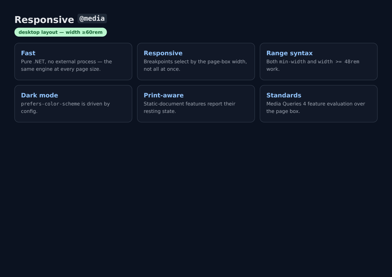
Dark Mode (prefers-color-scheme)
The same page rendered with `PdfGenerateConfig.PreferredColorScheme = PdfColorScheme.Dark`, so the `@media (prefers-color-scheme: dark)` rules apply — the dark surface and light text render, a utility framework's `dark:` variants included.
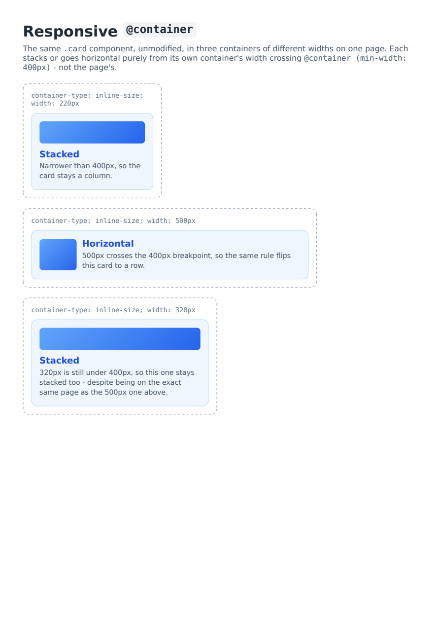
Responsive @container (size queries)
Three `container-type: inline-size` containers of different declared widths on one page, all using the identical `.card` component. The `@container card-shelf (min-width: 400px)` rule applies independently per container - the 500px one flips to a horizontal layout while the 220px and 320px ones stay stacked, proving the breakpoint reads each container's own resolved width rather than the page's.
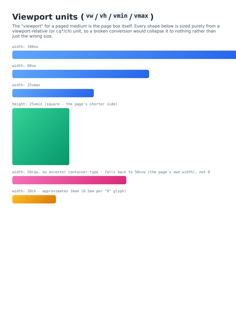
Viewport units (vw/vh/vmin/vmax)
Bars and boxes sized entirely from `vw`/`vmin`/`vmax` against a fixed A4 page - proving the page box is a real, working viewport numerator. Also includes a `cqw` box with no ancestor `container-type`, which now falls back to the small-viewport unit instead of collapsing to a zero-width box, and a `ch`-sized box (the `0.5em` approximation).
Text & Fonts
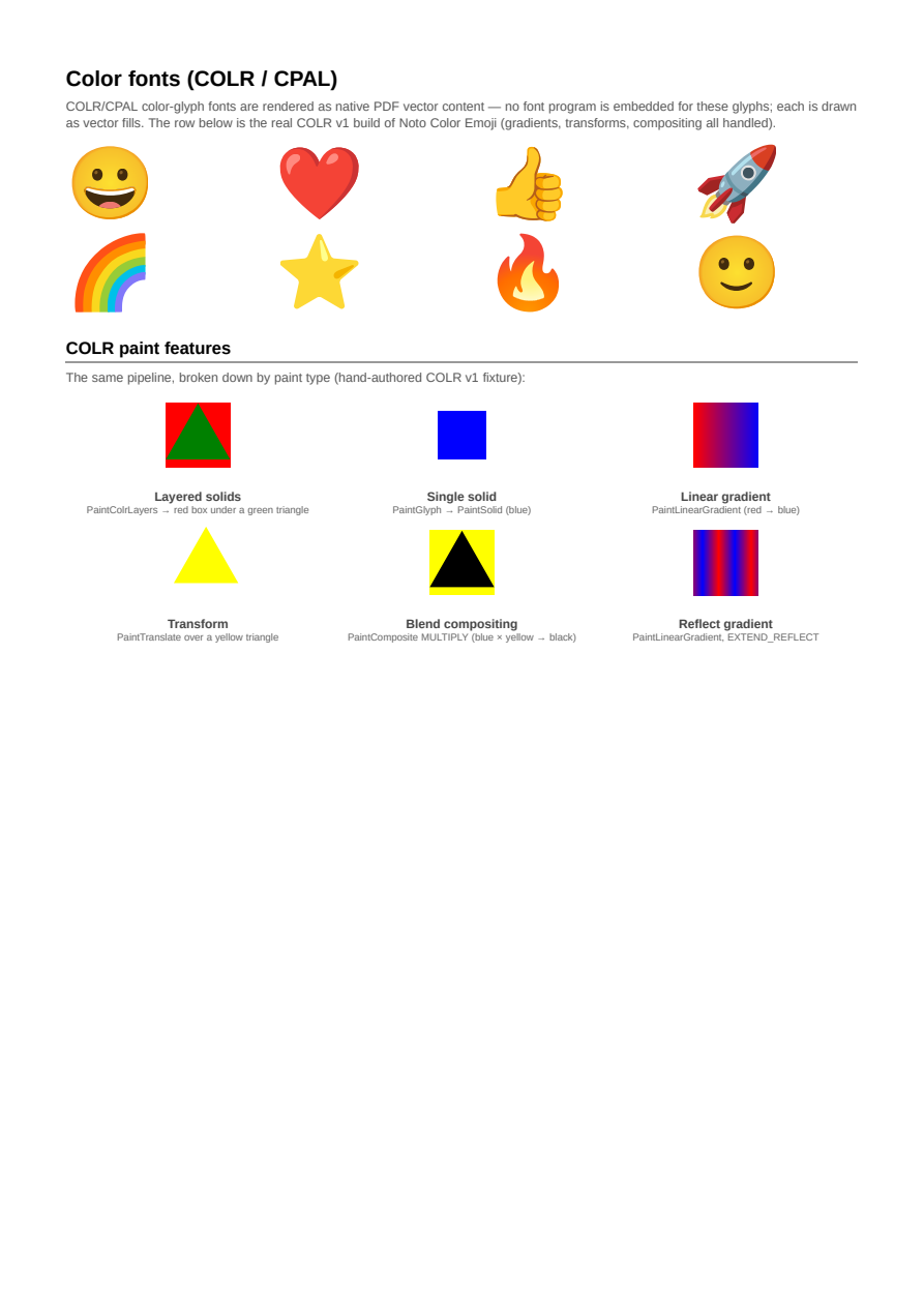
Color Fonts (COLR/CPAL)
COLR/CPAL color-glyph fonts — including the real COLR v1 build of Noto Color Emoji — rendered as native PDF vector content: layered palette colors, gradients, transforms, and blend-mode compositing. Glyphs are drawn as vectors, not embedded font programs.
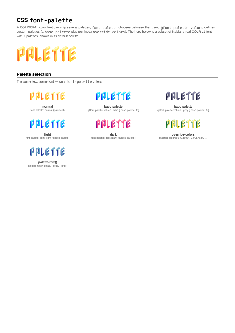
CSS font-palette
Selecting among a COLR/CPAL color font's palettes with the CSS font-palette property: the light/dark keywords, custom palettes via @font-palette-values (base-palette + override-colors), and palette-mix(). Rendered against a subset of Nabla, a real 7-palette COLR v1 font.
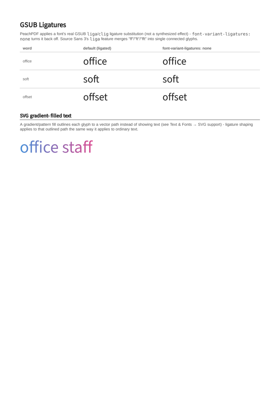
GSUB Ligatures
Real GSUB liga/clig ligature substitution (not a synthesized effect): font-variant-ligatures actually turns a font's ligatures on and off, for both ordinary text and gradient-filled SVG text.
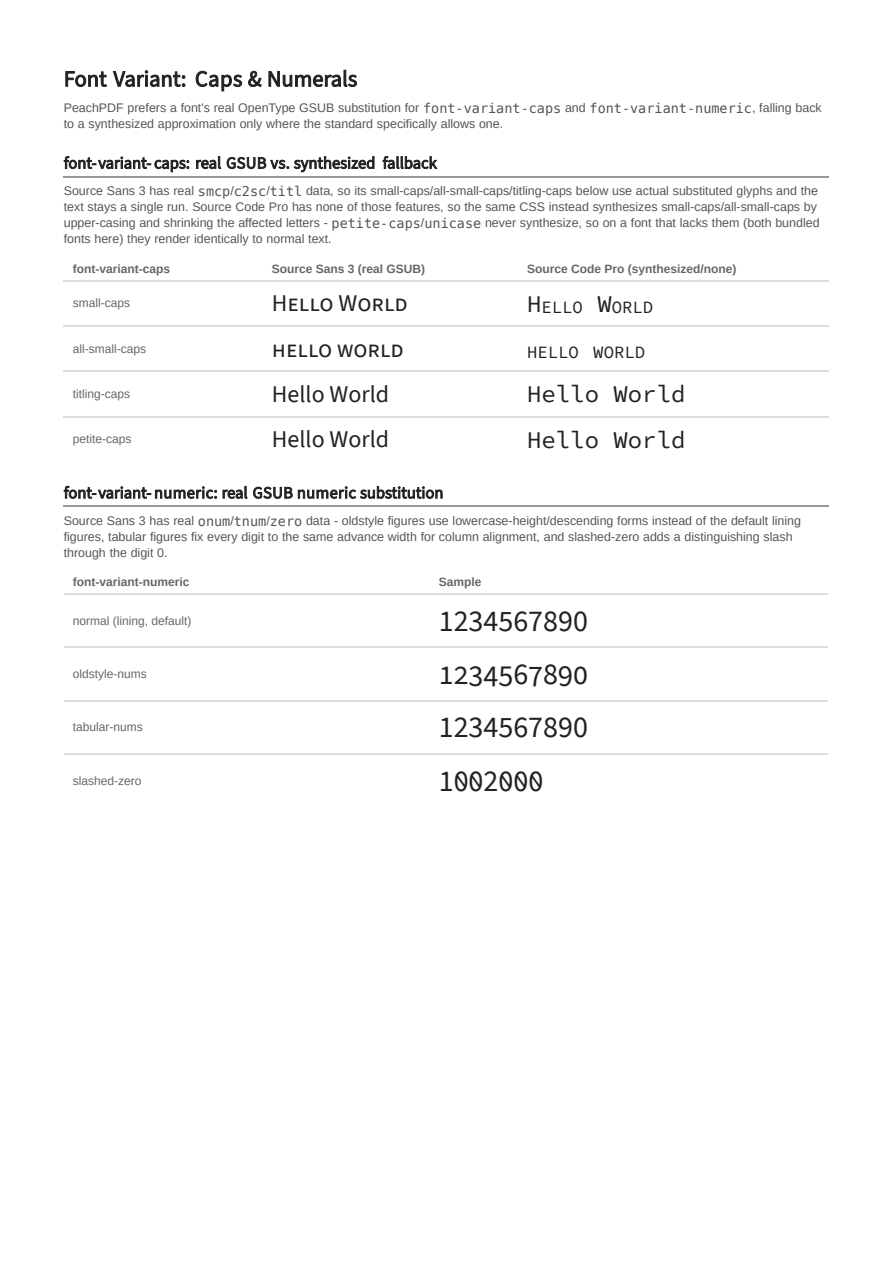
Font Variant: Caps & Numerals
font-variant-caps prefers a font's real GSUB smcp/c2sc/titl substitution, falling back to a synthesized approximation only where the standard allows it; font-variant-numeric activates a font's real oldstyle/tabular/slashed-zero GSUB features the same way.
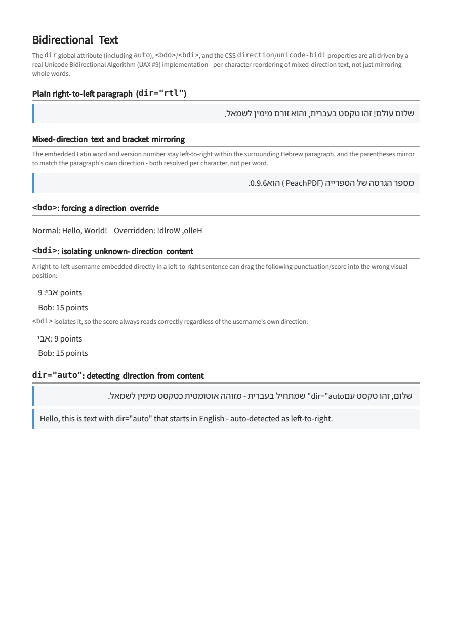
Bidirectional Text (dir, bdo, bdi)
A real Unicode Bidi Algorithm (UAX #9): the dir global attribute (incl. auto-detection), bdo/bdi, and CSS direction/unicode-bidi, with per-character reordering, digit/Latin run embedding, and bracket mirroring in real Hebrew text.
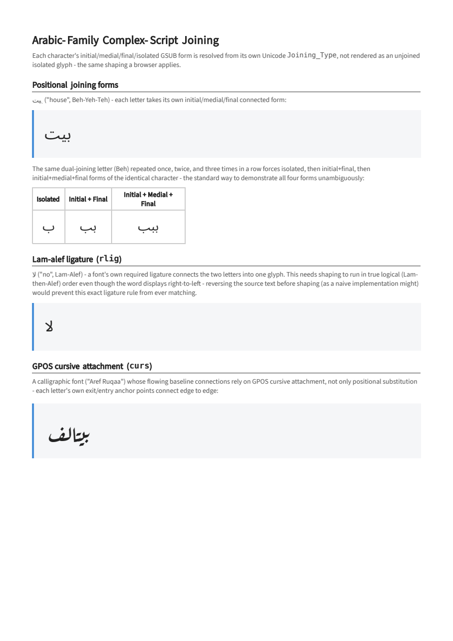
Arabic-Family Complex-Script Joining
Positional initial/medial/final/isolated GSUB joining forms resolved from each character's own Unicode Joining_Type, a font's rlig lam-alef ligature, and GPOS cursive attachment (curs) for a calligraphic font whose joining relies on it.
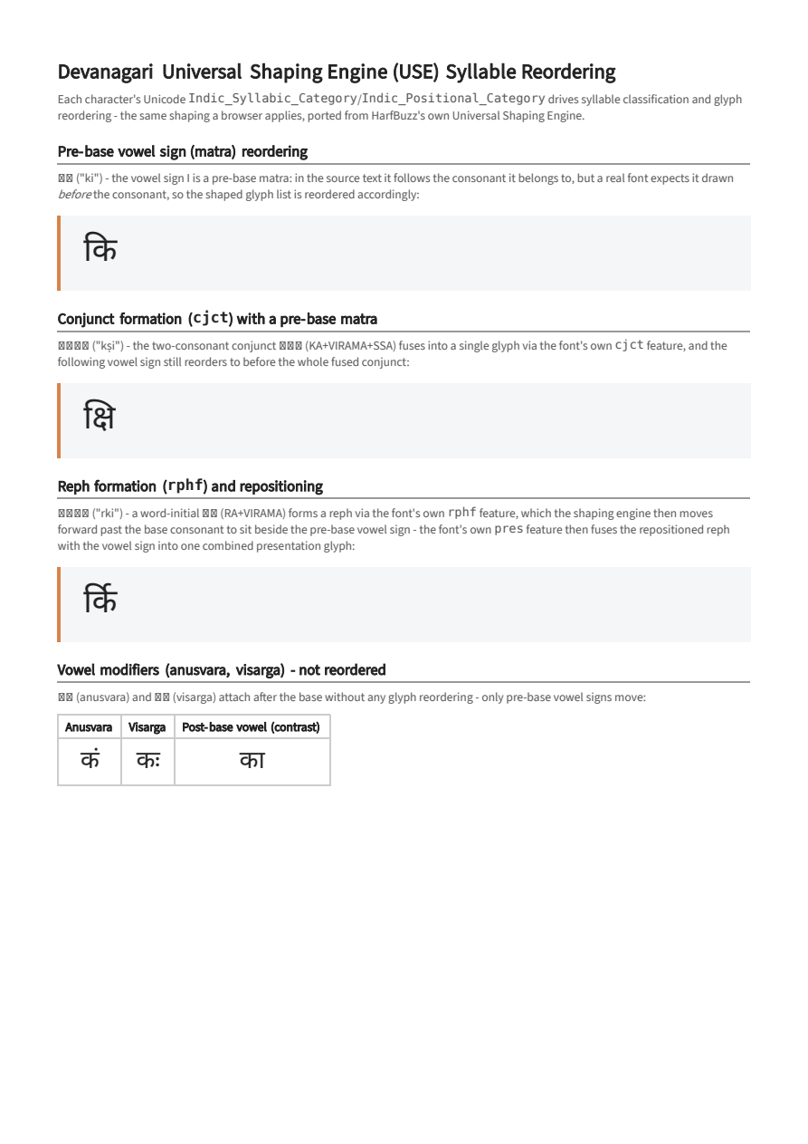
Devanagari Universal Shaping Engine (USE)
Indic_Syllabic_Category/Indic_Positional_Category-driven syllable classification, GSUB conjunct (cjct)/reph (rphf) formation, and the resulting glyph reorder (repha repositioning, pre-base matra movement) - ported from HarfBuzz's own Universal Shaping Engine.
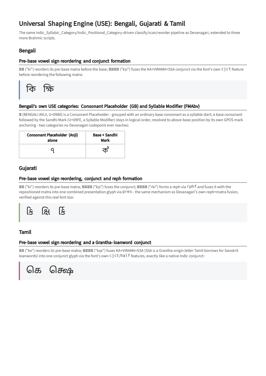
USE: Bengali, Gujarati & Tamil
Universal Shaping Engine syllable reordering extended to three more Brahmic scripts - pre-base matra movement, conjunct (cjct)/reph (rphf) formation, and Bengali's own two additional USE categories (Consonant Placeholder, Syllable Modifier) no Devanagari codepoint reaches.
Interactivity
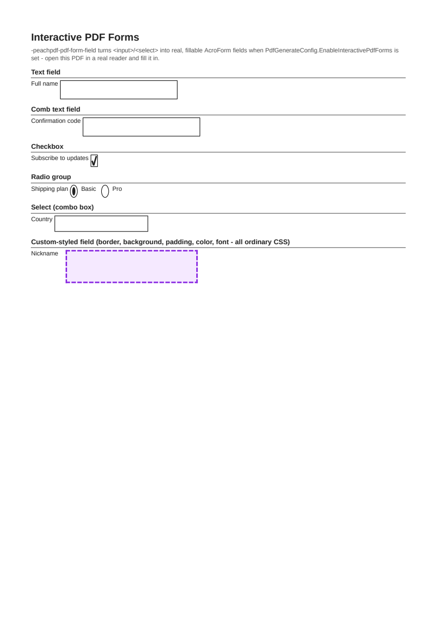
Interactive PDF Forms
Real, fillable AcroForm text/checkbox/radio/select fields generated from ordinary <input>/<select> markup via EnableInteractivePdfForms.